Radial Bar Chart
Compare categories with precision and flair. Our advanced Radial Bar Chart tool allows you to move past traditional grids, offering a sophisticated way to visualize complex rankings and KPIs in one stunning, space-efficient view
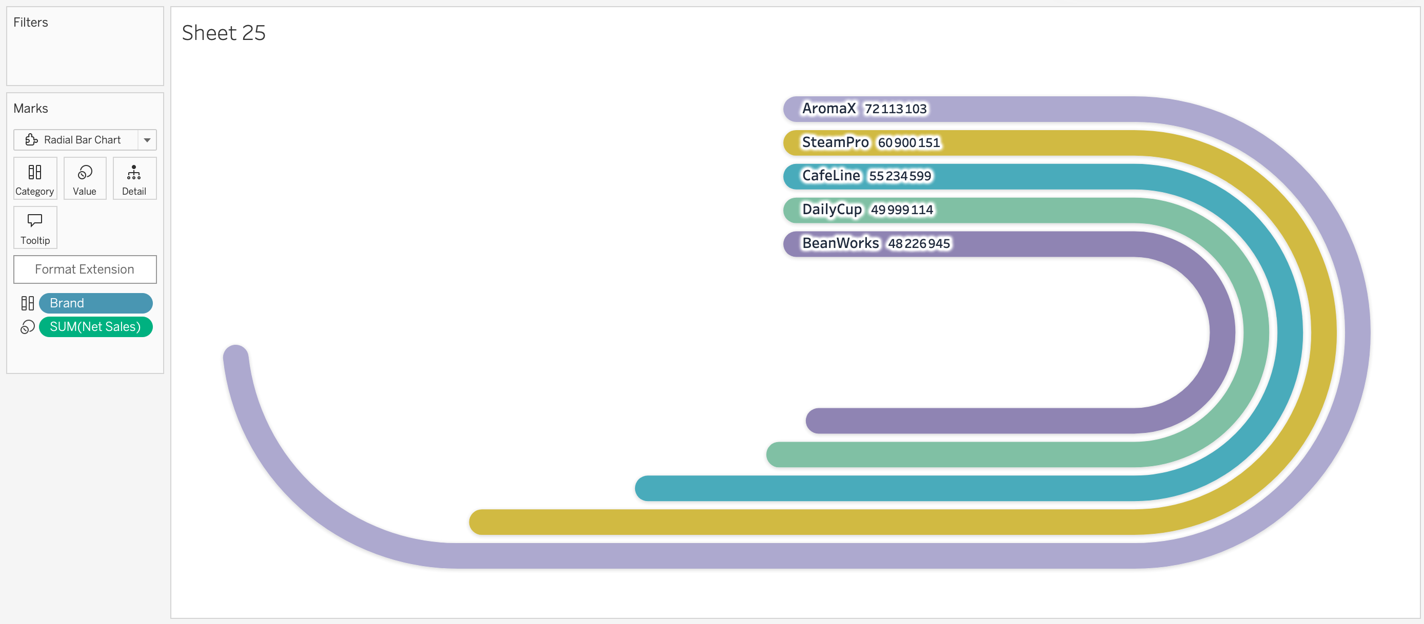
Circular Data Storytelling
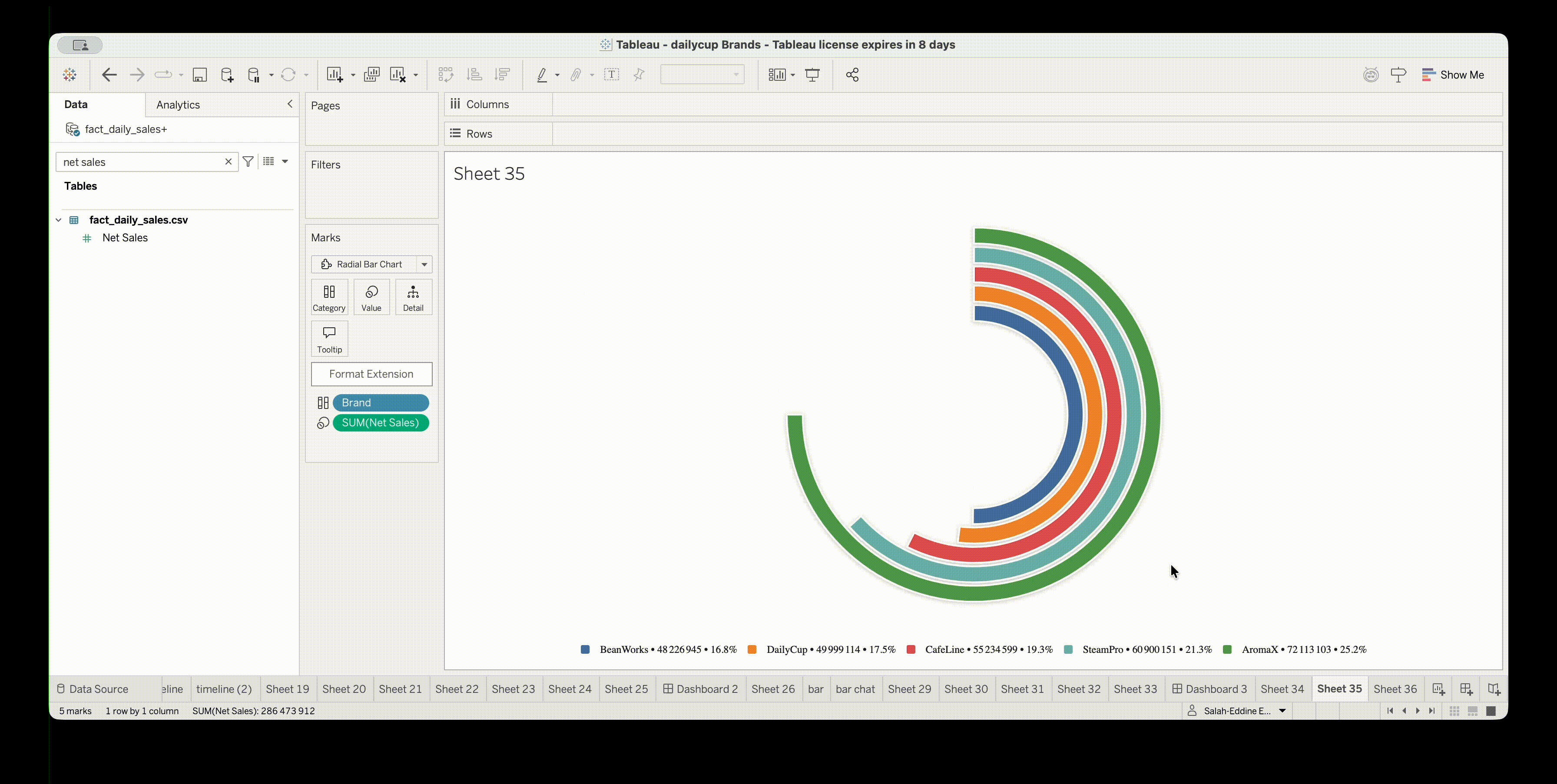
Radial Bar Charts offer a compelling way to compare categories while saving valuable dashboard real estate.
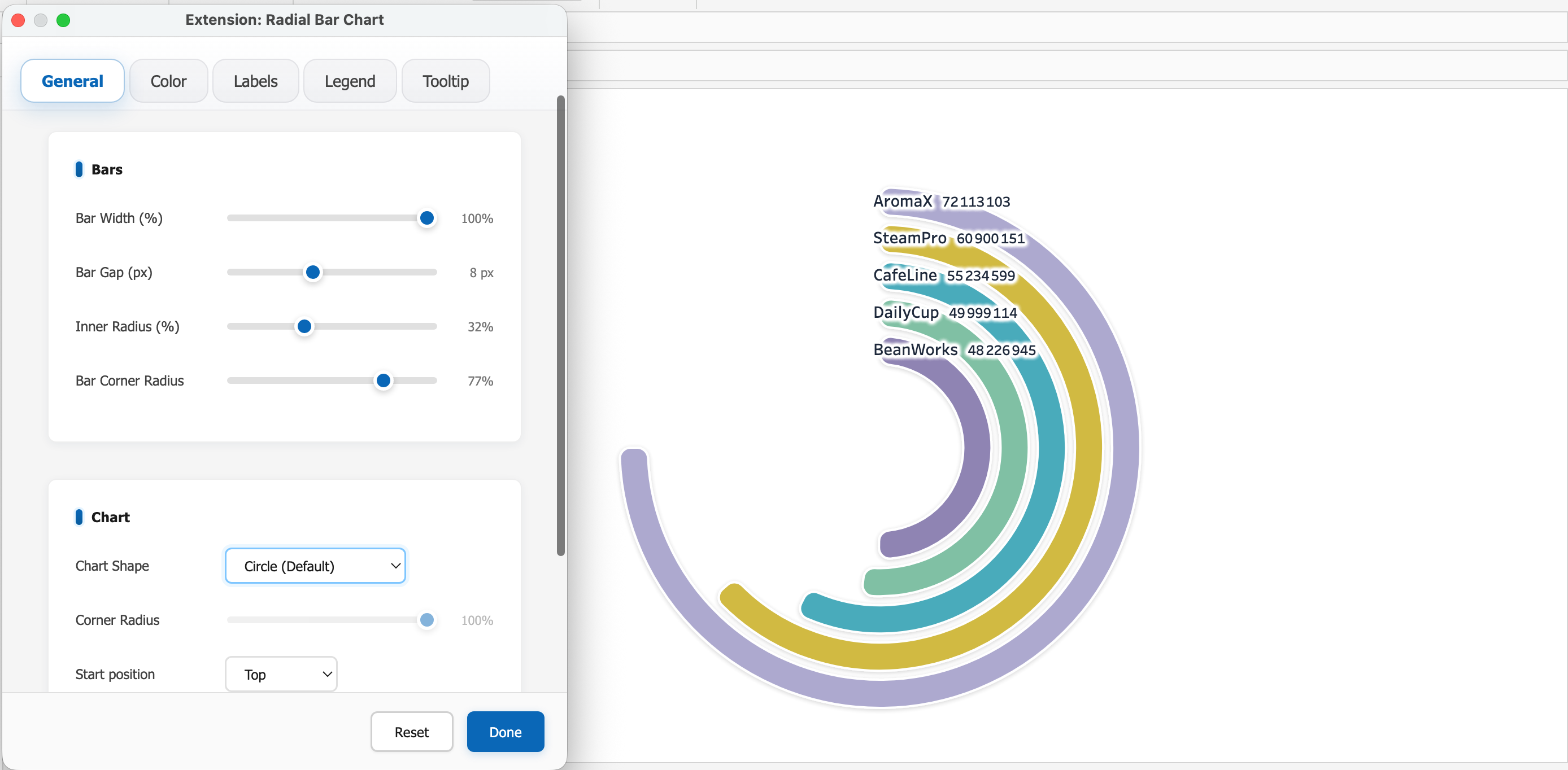
Precision-tune every detail
Unlock total creative control with dynamic formatting. Adjust scales, colors, and layouts in real-time to refine your visualization until it perfectly captures your data’s story
Space Efficient
Display more categories in a compact circular format, perfect for high-density dashboards. Maximize your screen real estate without sacrificing readability
Beautiful Aesthetics
Modern, clean design that enhances the professional look of your reports. Impress your stakeholders with visuals that pop.

Try our viz extensions for free
Discover how Dataskera can transform your Tableau experience