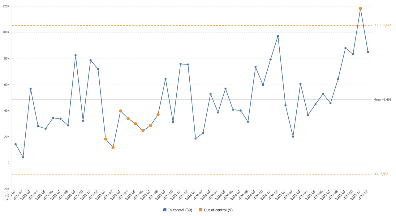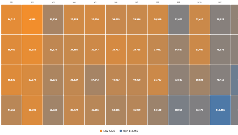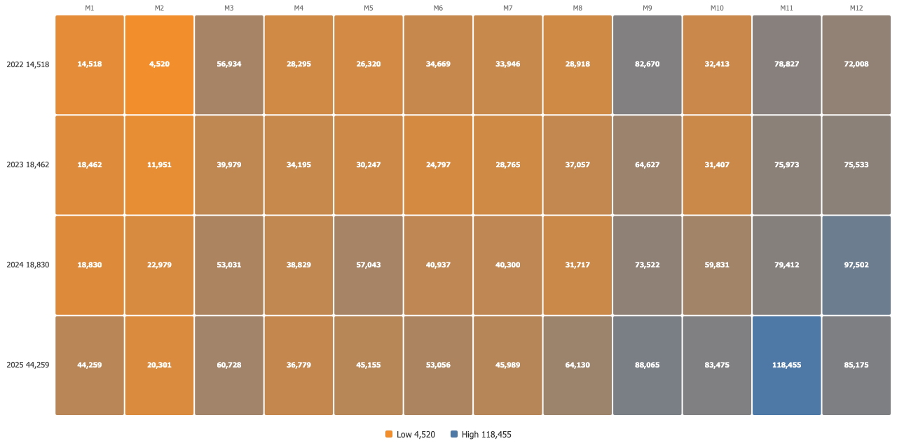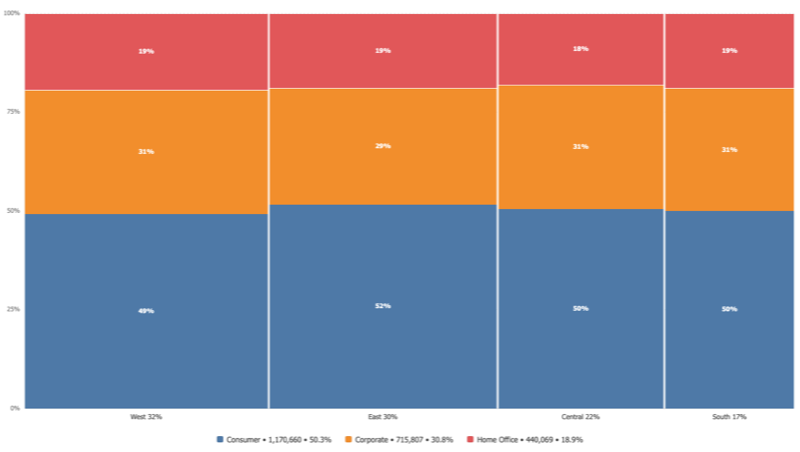

Waffle Chart is live on the Tableau Exchange

Transform complexity into clarity.

Viz extensions, training, and consulting to get the most out of Tableau.

DATAVIZ

Tableau Extensions
Custom Widgets
Dashboard Design
UX/UI Expert
Tableau Cloud
Desktop
Learn
Viz
Filter
DATEPART('year', [Date])
{FIXED [Region]: SUM([Sales])}

Extensions

Clear visualizations, with minimal effort.

by data analysts, for data analysis
Waffle Chart
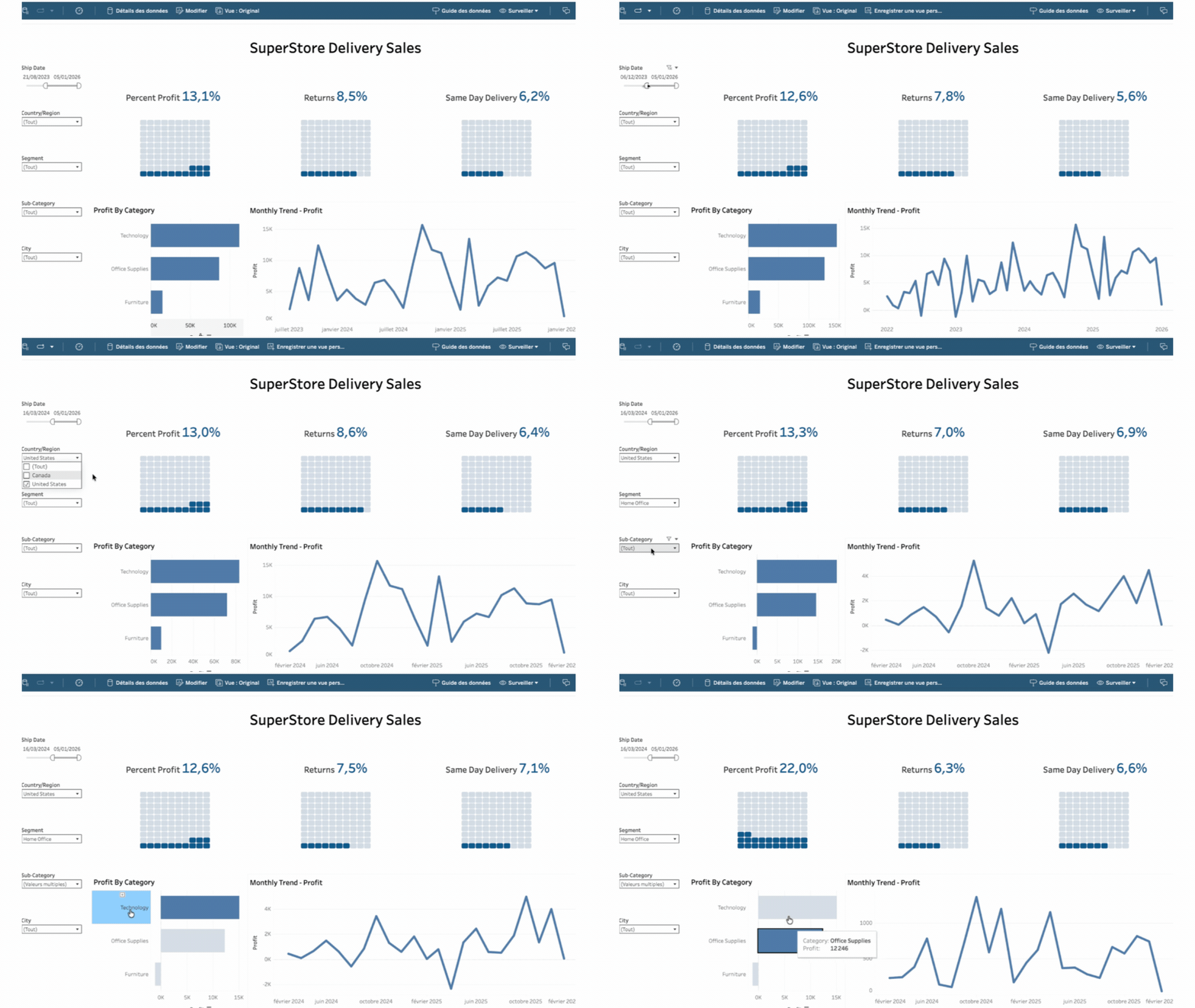
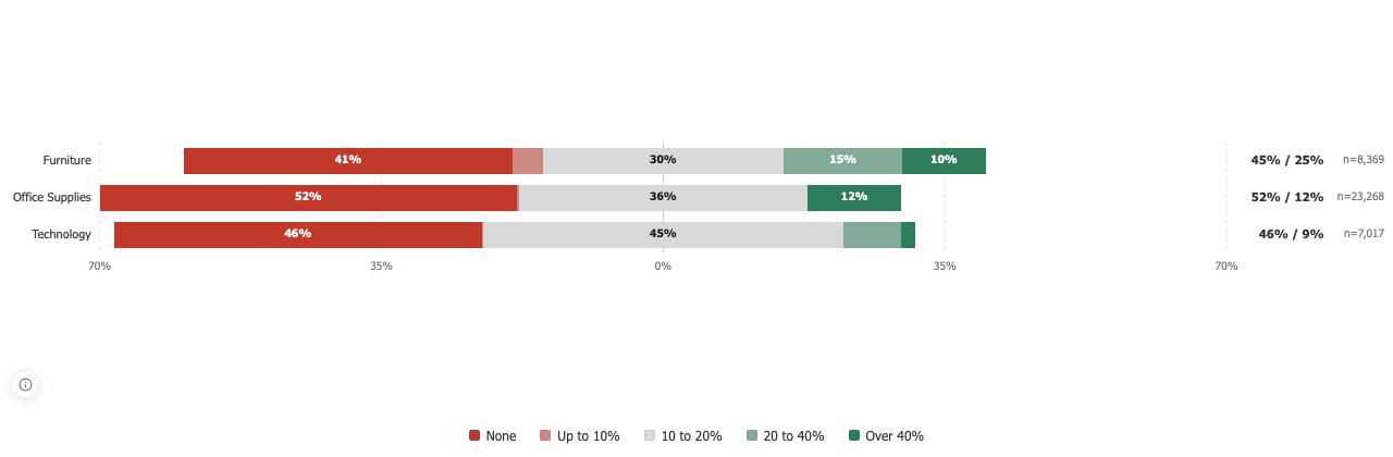
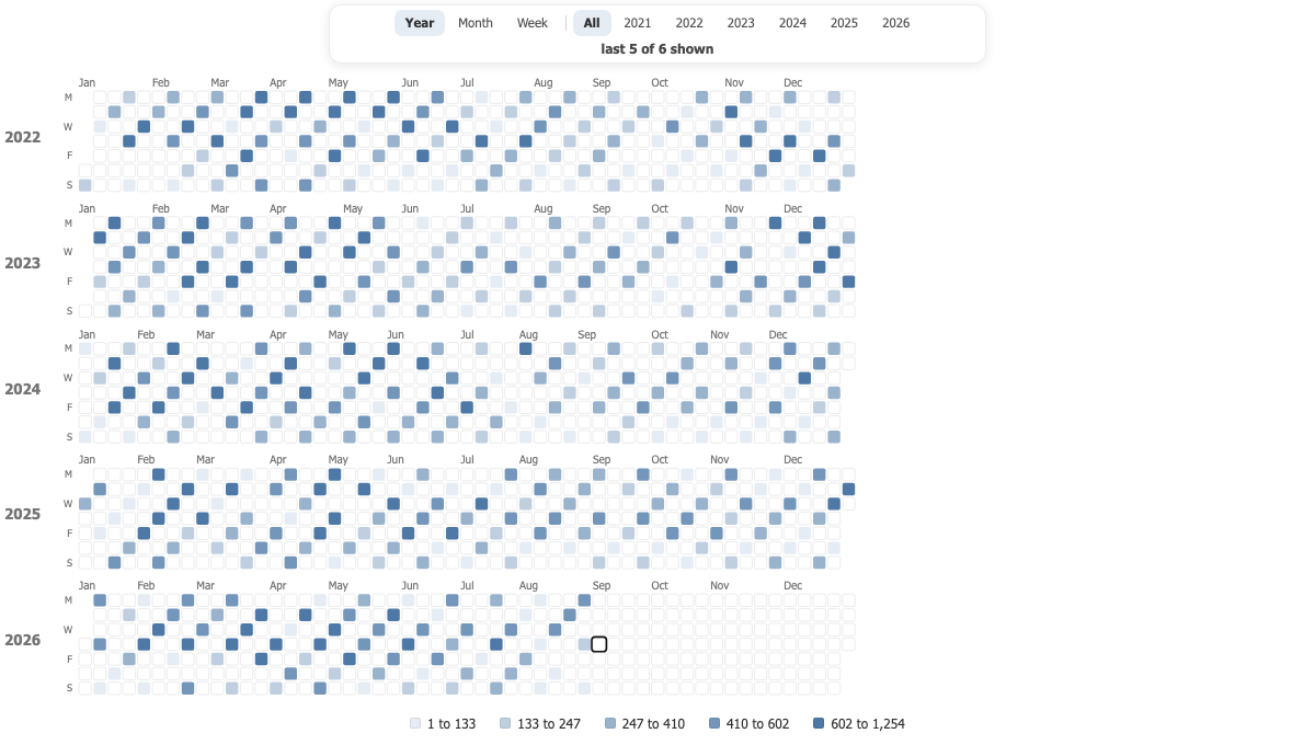
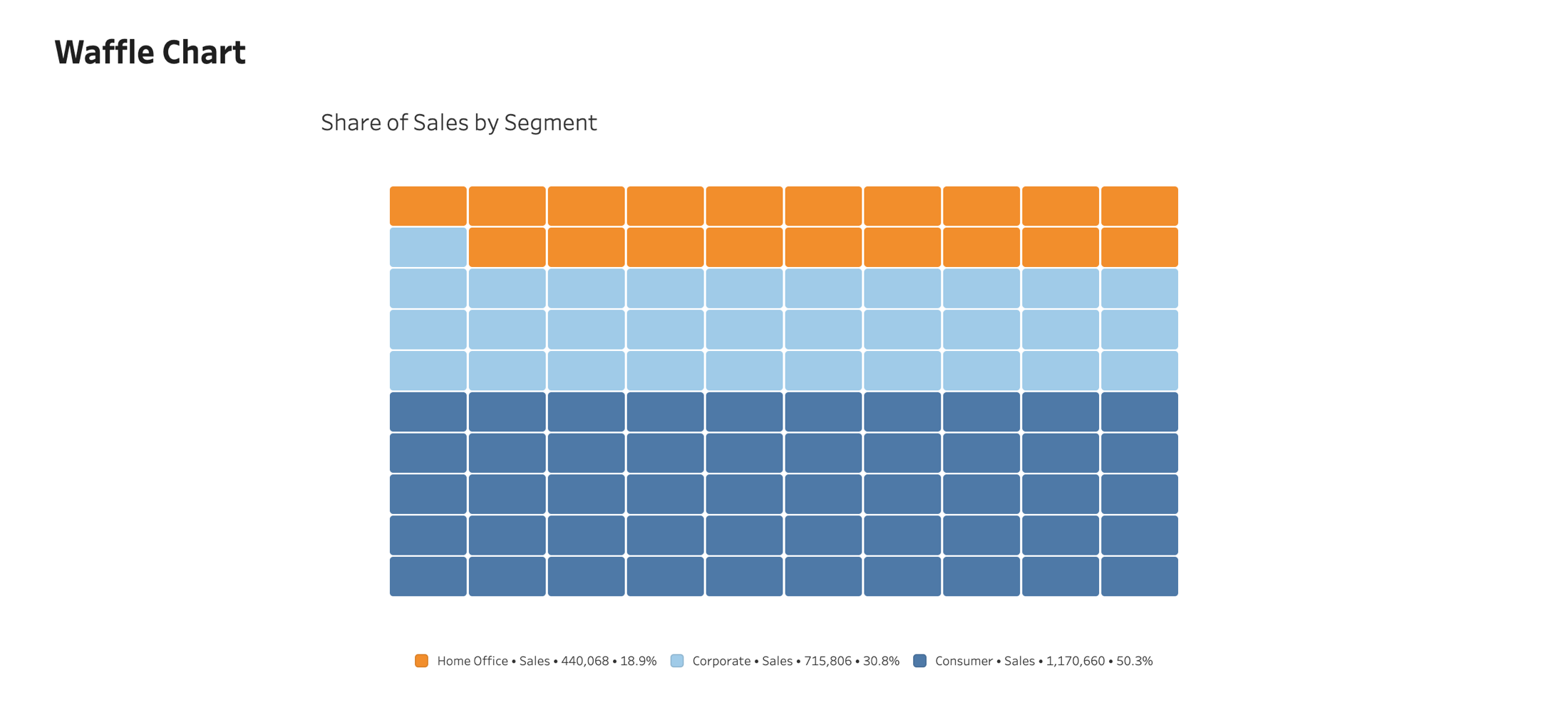
Read proportions precisely. The Waffle Chart displays categorical proportions as a grid of colored squares, making part-to-whole comparisons easy to read.
Overview
Native Tableau integration
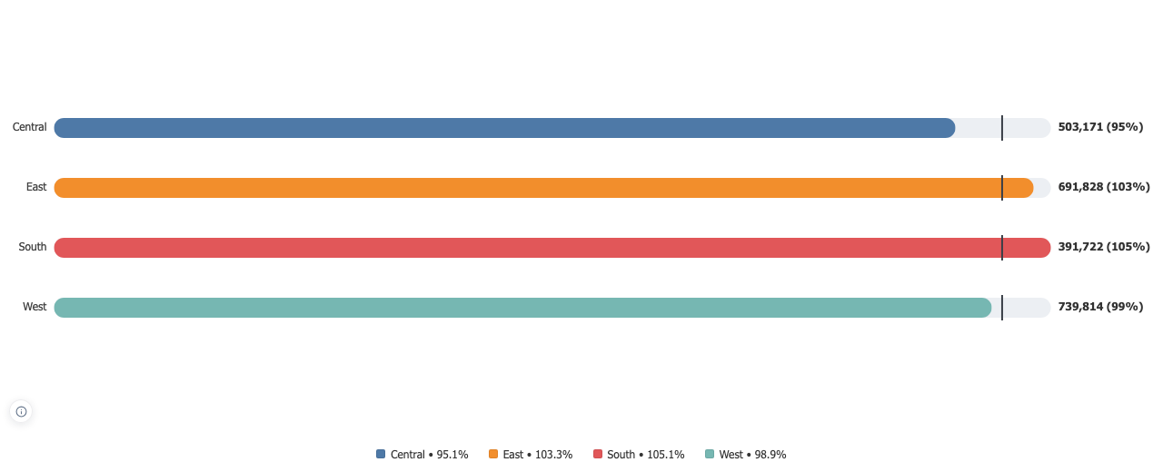
Native to your dashboard Add it to a worksheet like any Tableau viz. It follows your filters, sorts, and dashboard actions, and refreshes live as the data changes. Nothing to export, connect, or configure.
Native Tableau integration
Radial Bar Chart
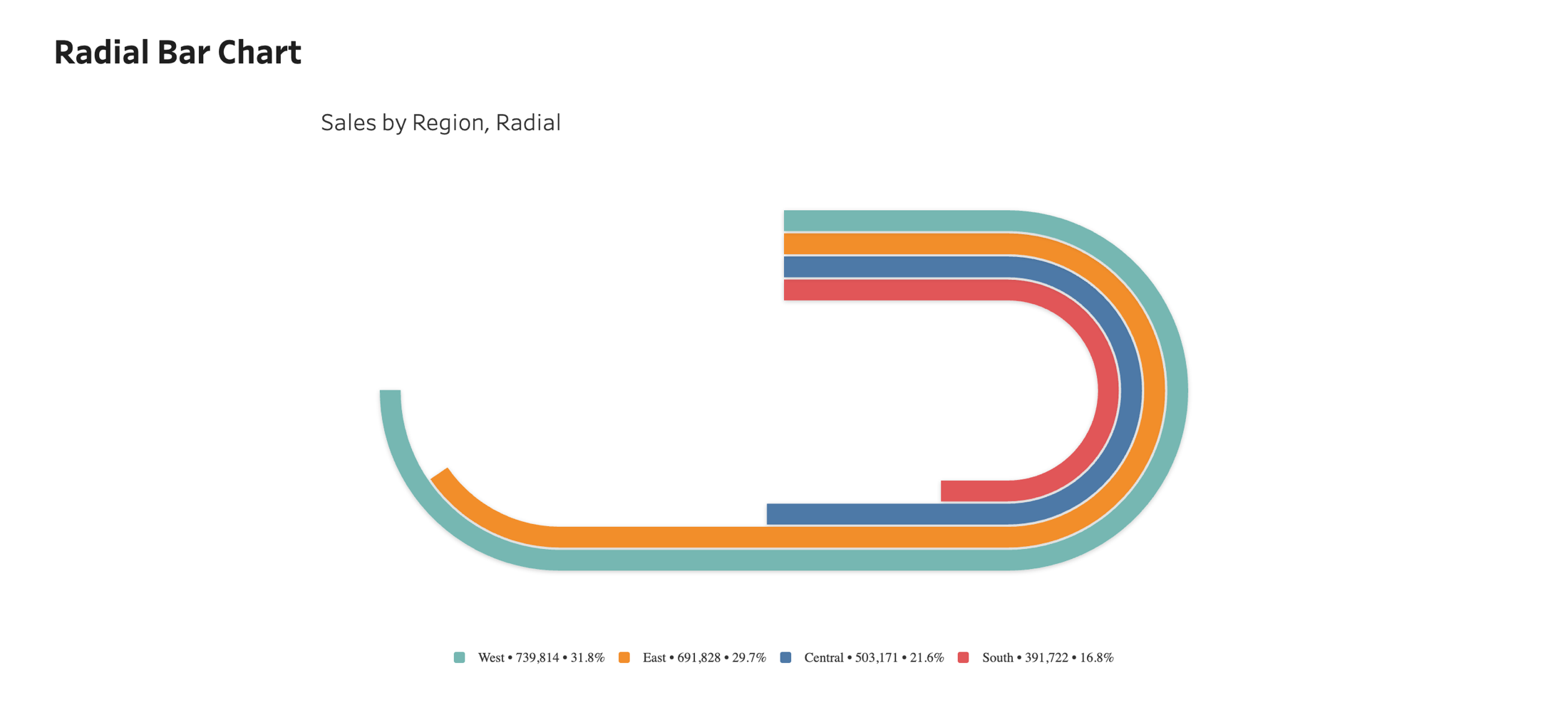
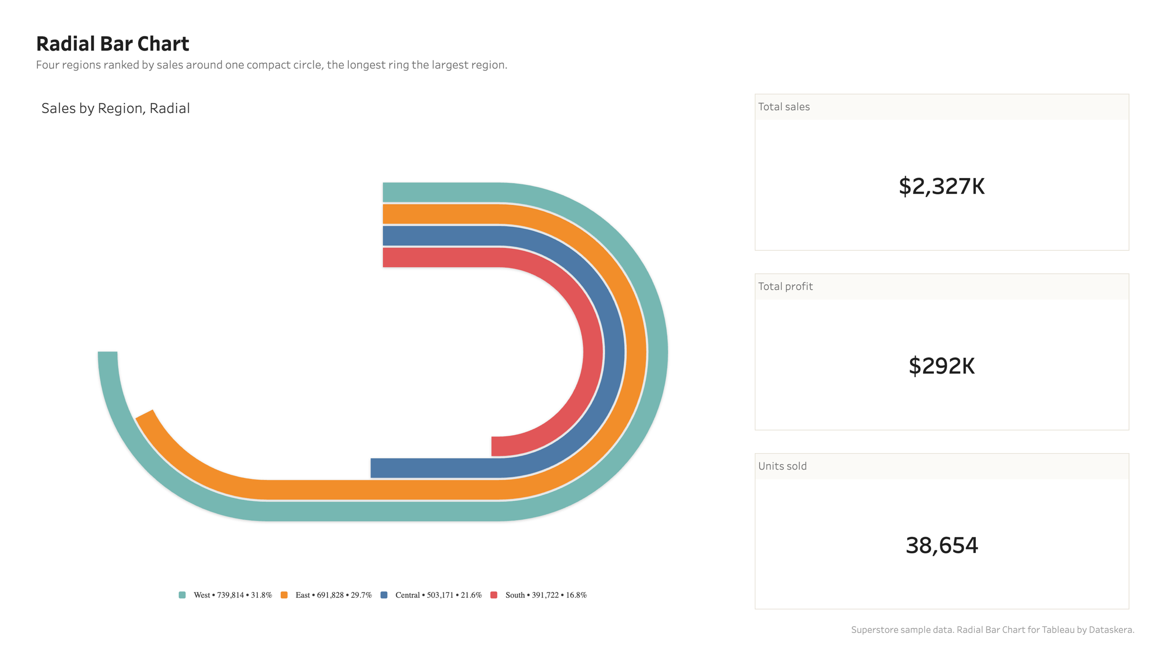
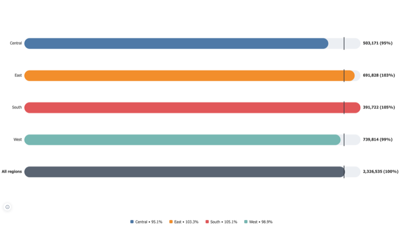
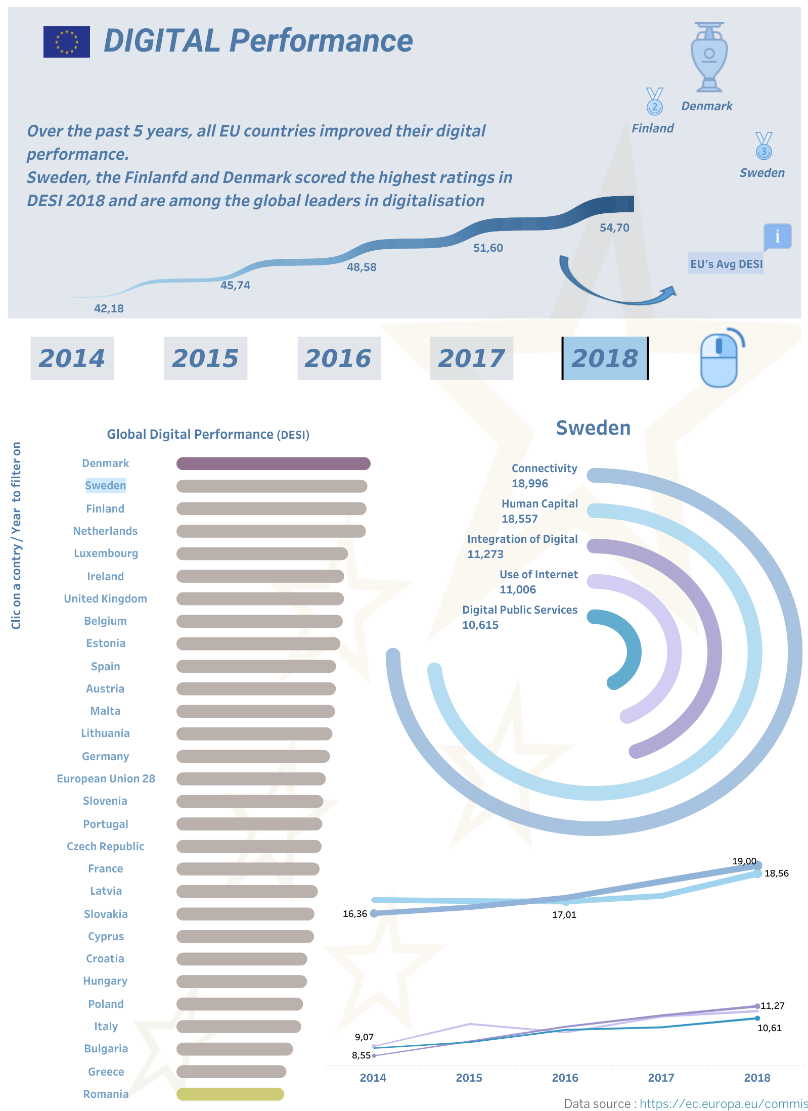
Turn a long bar chart into a compact circle. Compare many categories at a glance, ideal for rankings and part-to-whole views, without running off the edge of your dashboard.
Overview
Compact by design
Drag a dimension to Category and a measure to Value, and the rings render and scale on their own. Everything runs inside Tableau, on your machine: your data never leaves the browser. Free to use, on Desktop, Server, and Cloud.
Compact by design
Table View
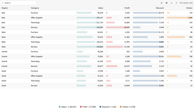
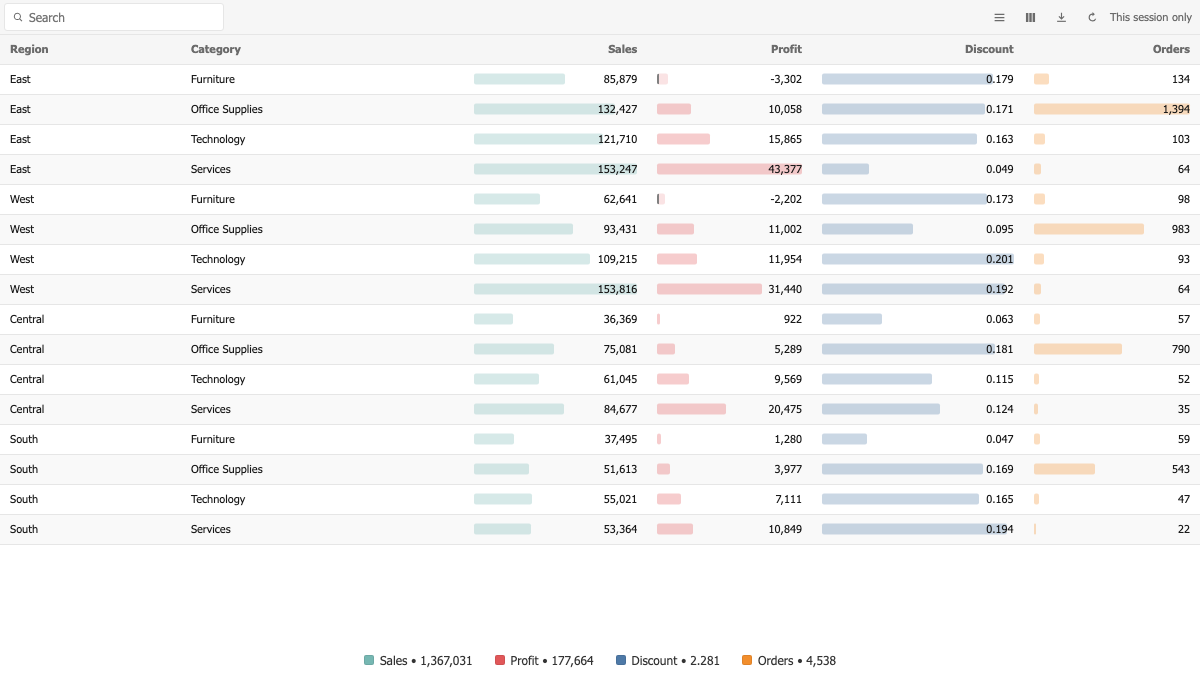
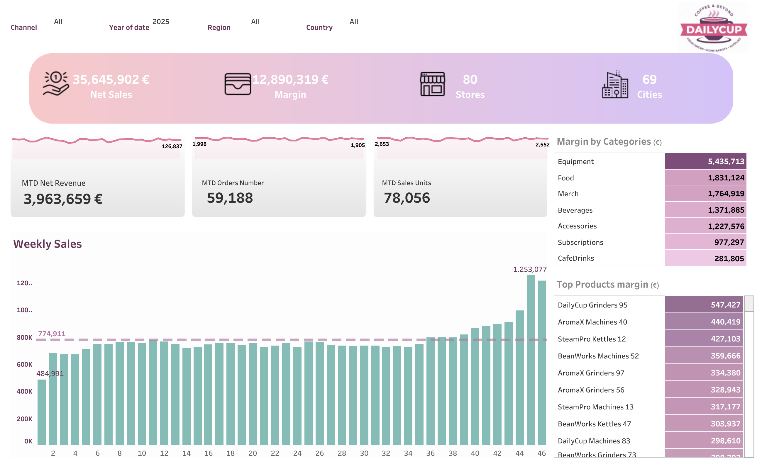
A table that reads like a report, with every column formatted on its own terms.
Overview
Bars and numbers, from the start
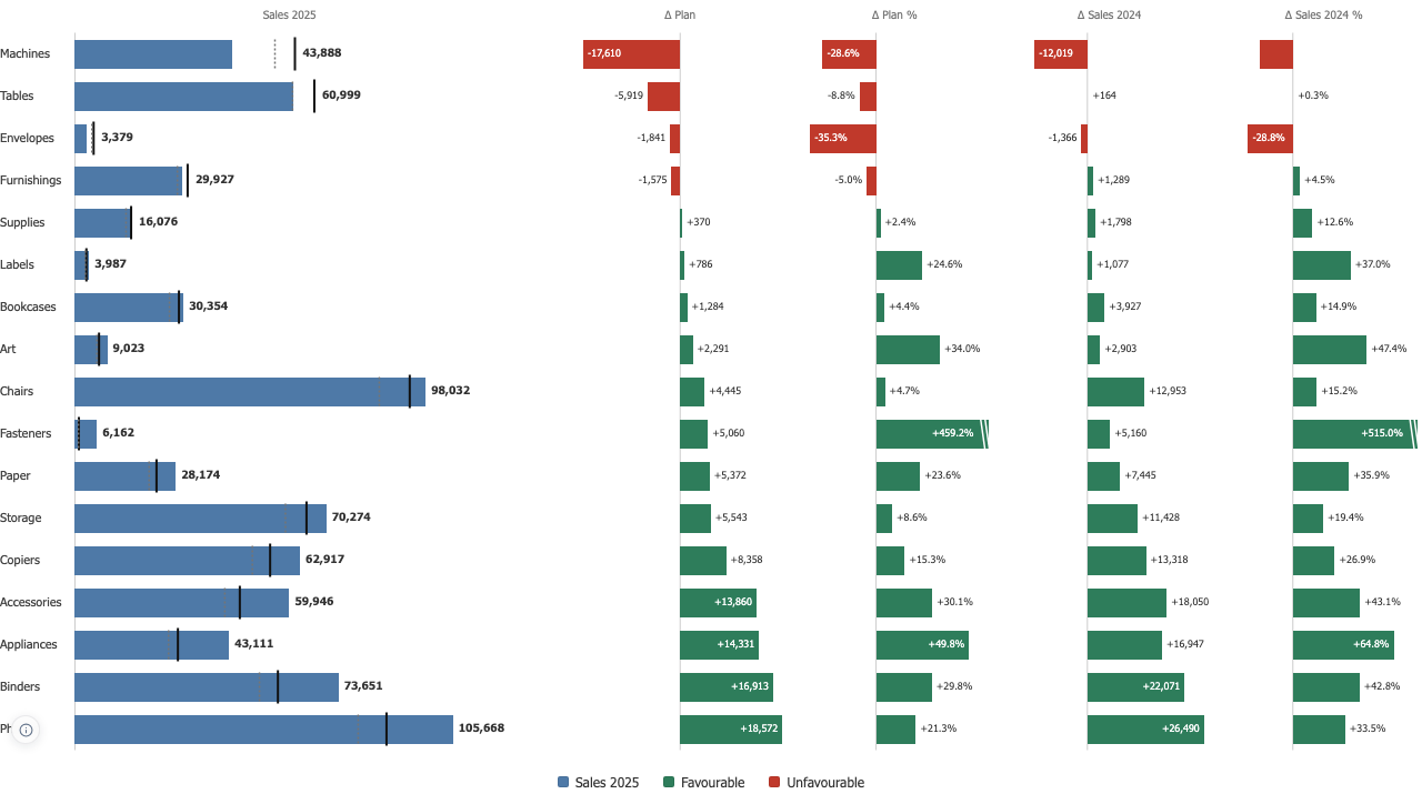
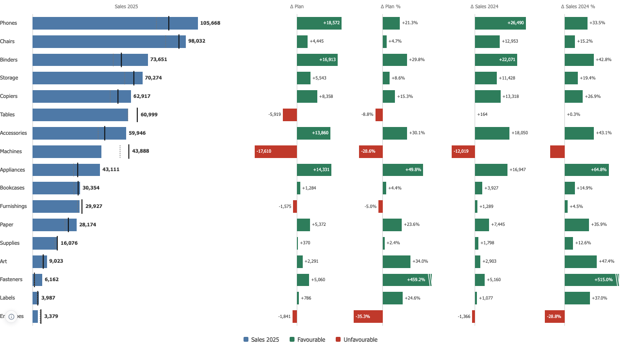
The shape is what a reader compares, the number is what they quote, so a column shows both by default. Up to 25 dimensions and 40 measures on one table.
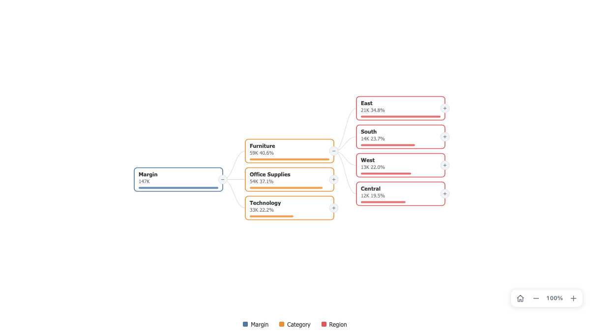
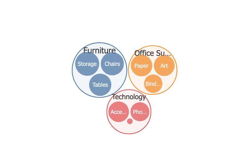
Bars and numbers, from the start
Waterfall Chart
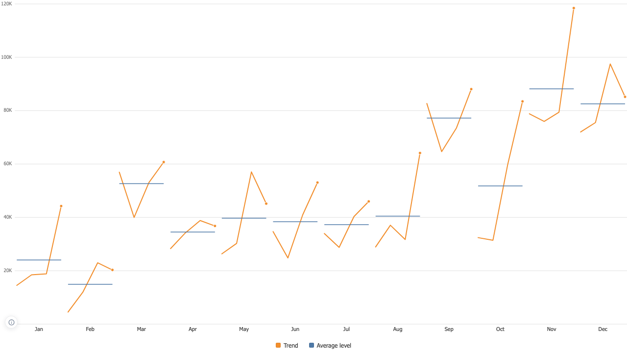
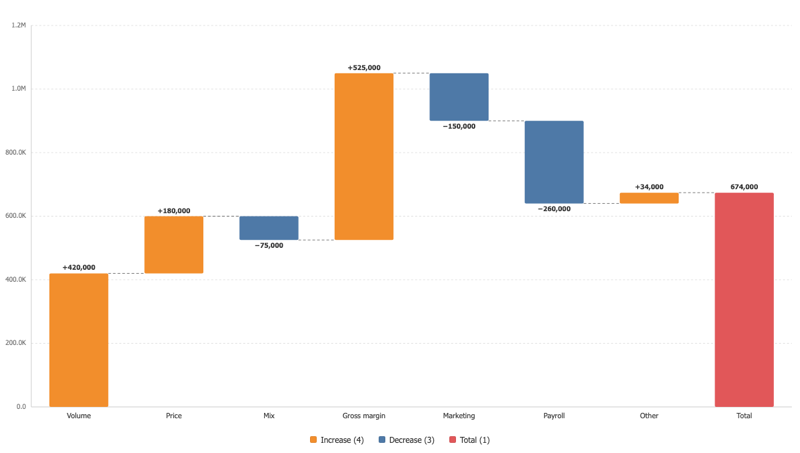
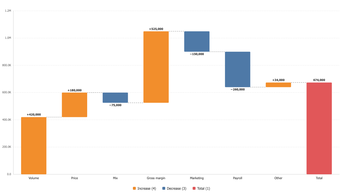
A starting value, a run of changes, an ending value, with the arithmetic on show.
Overview
Built for a bridge
Steps stay in the order Tableau delivers them, because a waterfall is a narrative and sorting by size would tell a different one. Opening and closing bars are one click away.
Built for a bridge
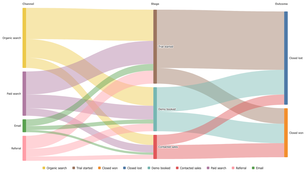
Sankey Diagram
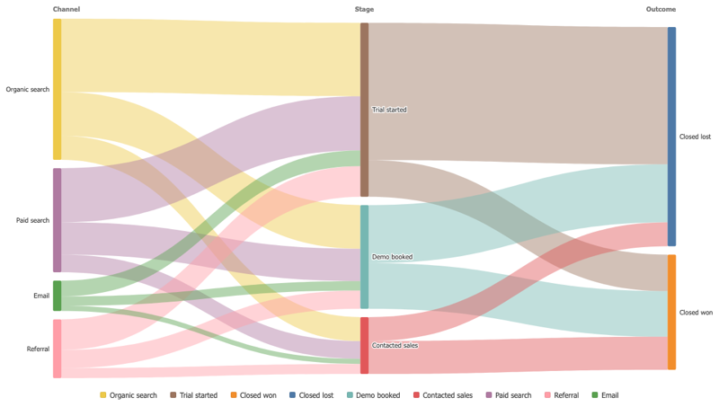
Follow a quantity as it splits and merges from one stage to the next, and see where the flow stops.
Overview
Two stages or five
Drop the dimensions on Levels in the order the flow runs. Two levels give a plain source to target diagram, five give a full path through your data.
Two stages or five
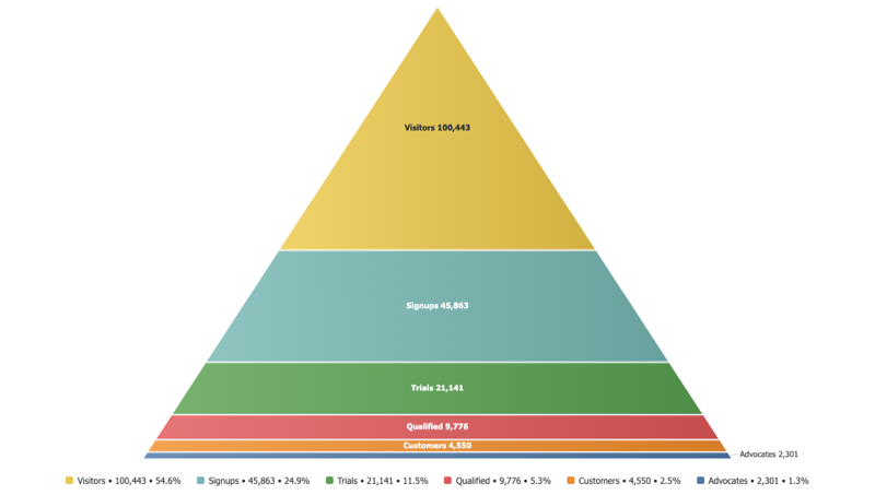
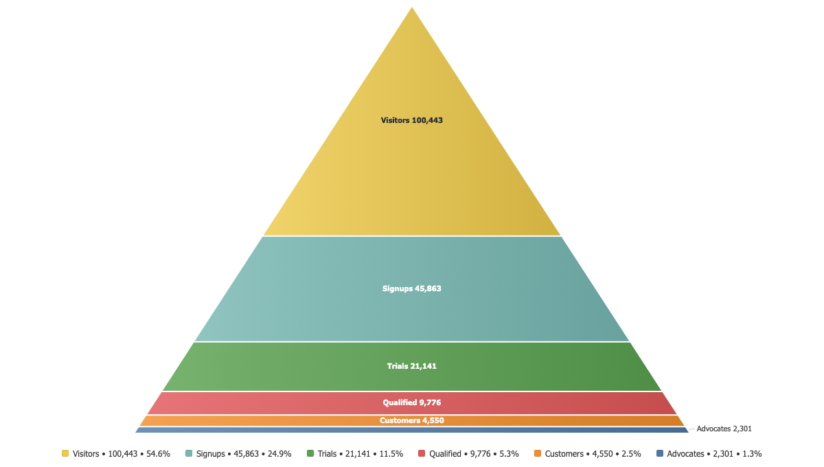
Pyramid Chart
Stages stacked from the widest to the narrowest, so a funnel reads as a shape.
Overview
Made for a funnel
Each band carries its stage and its value, and the conversion from one stage to the next is one placeholder away in the tooltip and in the labels.
Made for a funnel
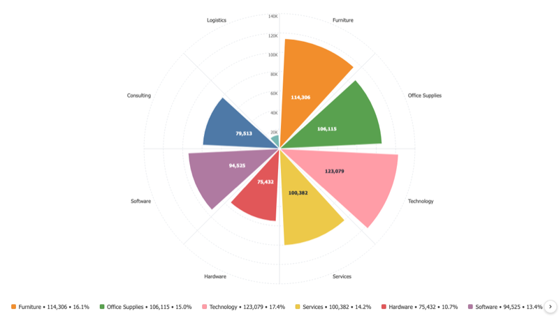
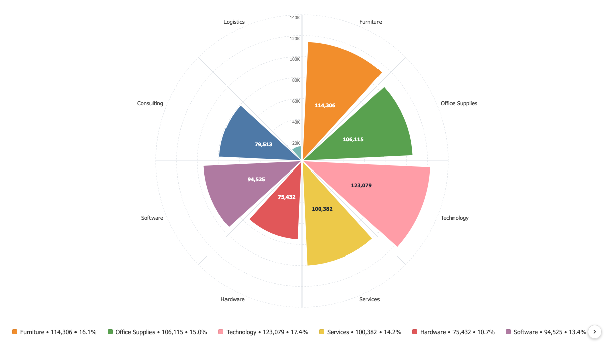
Polar Bar Chart
Bars laid out around a circle, so a cyclical pattern reads as a shape instead of a row.
Overview
Built for cycles
Sales by hour, incidents by weekday, wind by direction. The first and the last category sit next to each other, which is where the pattern usually is.
Built for cycles
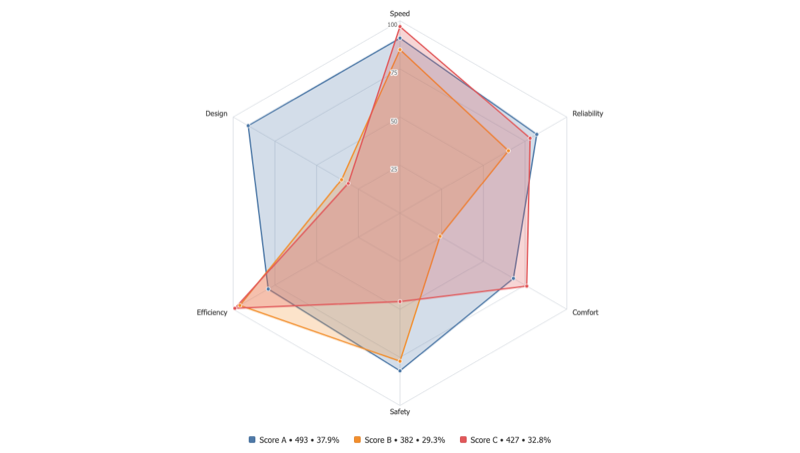
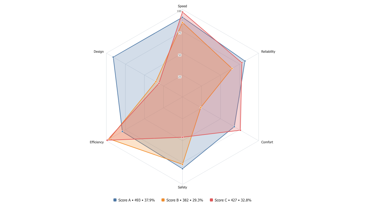
Radar Chart
Compare several measures, or several series across the same axes, on one circular grid.
Overview
One shape per series
Drop several measures for one series each, or a single measure with a dimension for one shape per value. Both shapes of data draw the same chart.
One shape per series
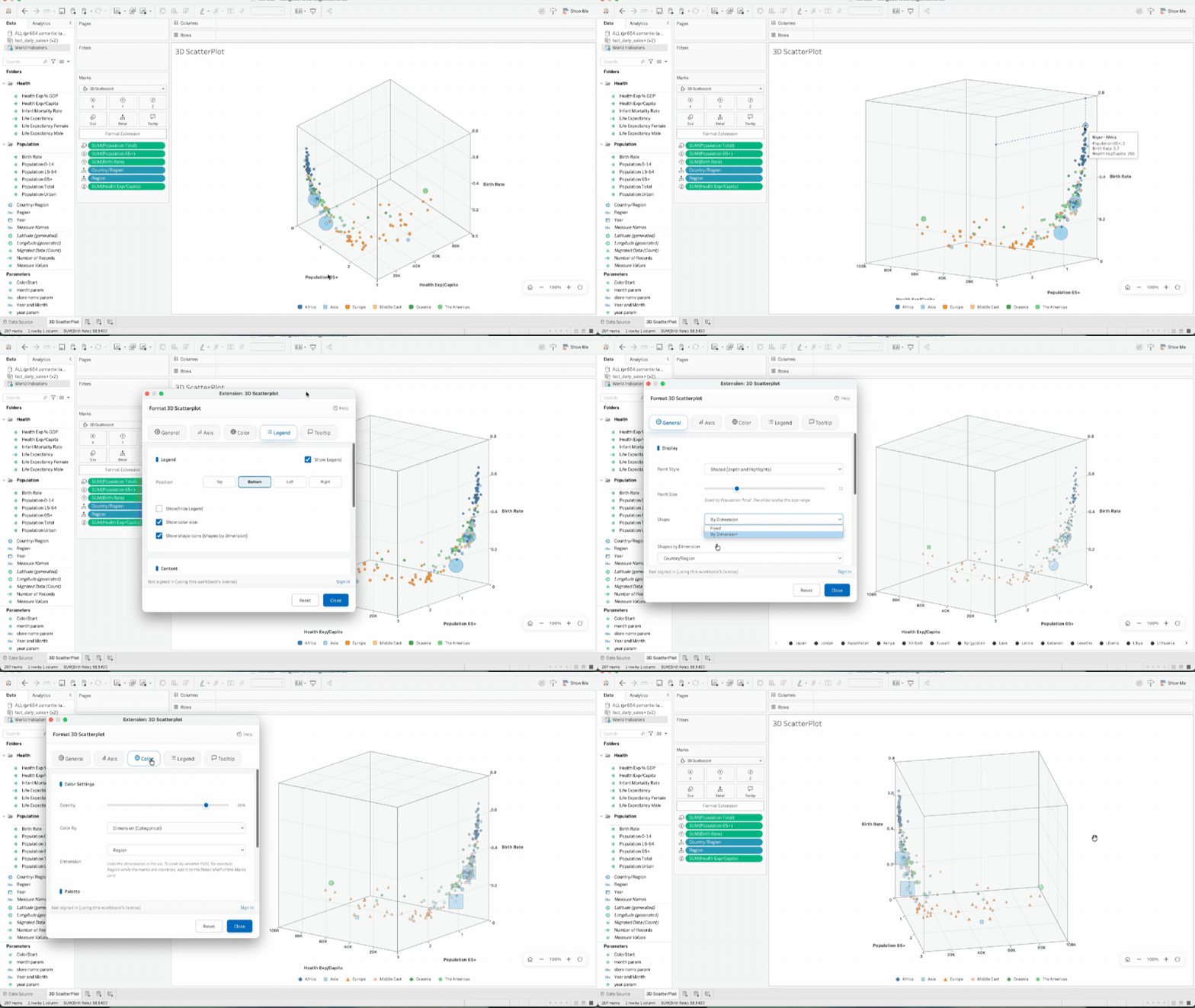
3D Scatter Plot
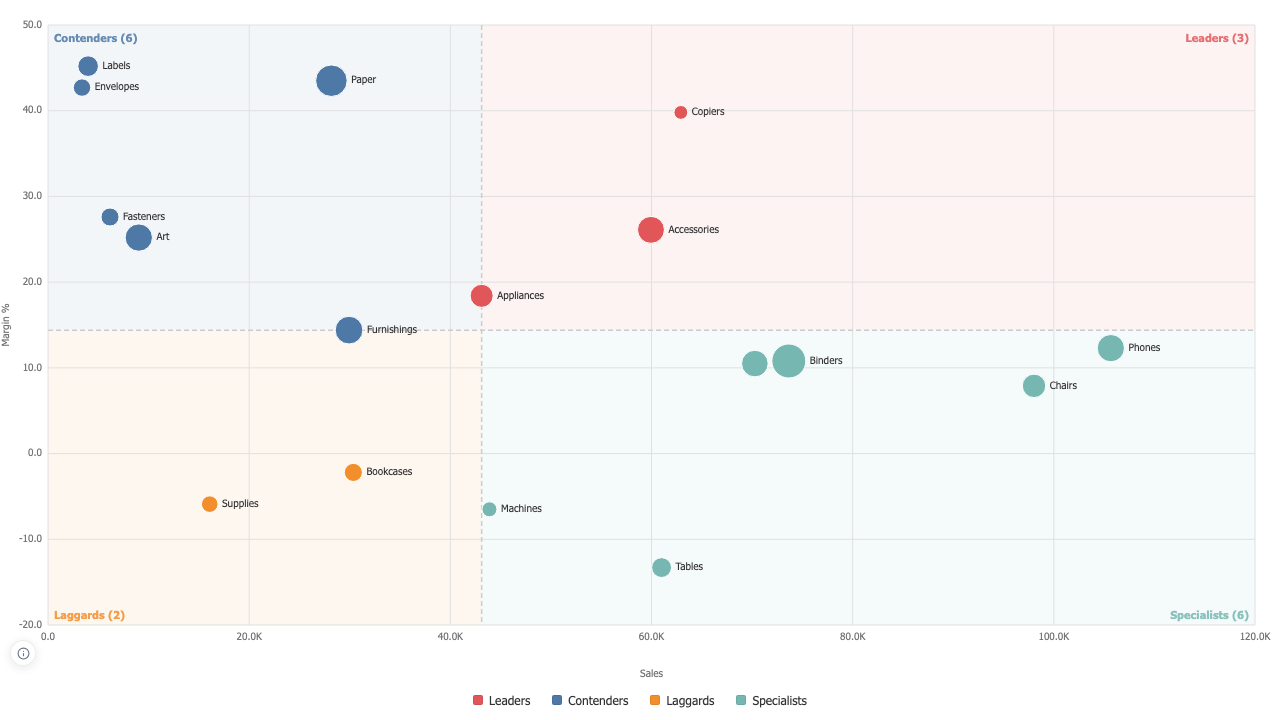
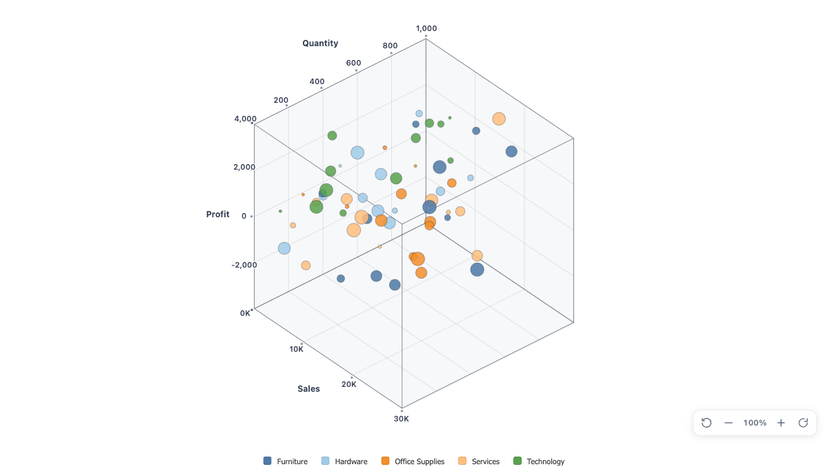
See three measures at once. The 3D Scatter Plot places your points in a real 3D axis box that you rotate and zoom inside your dashboard, with color and shape by category and an optional size measure.
Overview
Three measures, one picture
Drag measures to X, Y, and Z, and the axis box renders and scales on its own, with round-value ticks and smart K, M, and B units on every axis. Add a fourth measure to Size, and a dimension on the Detail shelf to color the points by category. With only two measures in play, it renders a classic 2D scatterplot automatically.
Three measures, one picture

Support you can count on · Our experts are available whenever you need help, while we maintain and update your extensions for optimal performance.

support@dataskera.com

Built by data analysts, for data analysts

Modern data-visualization extensions built on proven best practices to make complex insights instantly clear and easy to act on.

Innovative and customizable

Create visualizations that stand out, with flexible customization options that adapt to your users, dashboards, and data stories.

Stable and high-performing

Our data-visualization extensions deliver reliable performance and smooth operation, backed by our IT team’s expertise to ensure stability at every scale.

Expertise

From data to decisions.

Extensions, training, and consulting: one clear path from your data to your decisions.

Tableau Products

Visualization Extensions, Dashboard Extensions, and Accelerators to enrich your Tableau dashboards

  • Innovative Viz Extensions
  • Dashboard Extensions
  • Business Accelerators
Learn more

Training

Comprehensive Tableau training, in-person or remote, for all levels

  • Tableau Desktop
  • Tableau Server/Cloud
  • Tableau Prep
Explore training

Consulting

Personalized support on Tableau and Data strategy for your enterprise projects

  • Tableau Architecture
  • Data Viz Strategy
  • Audit & Optimization
Explore consulting