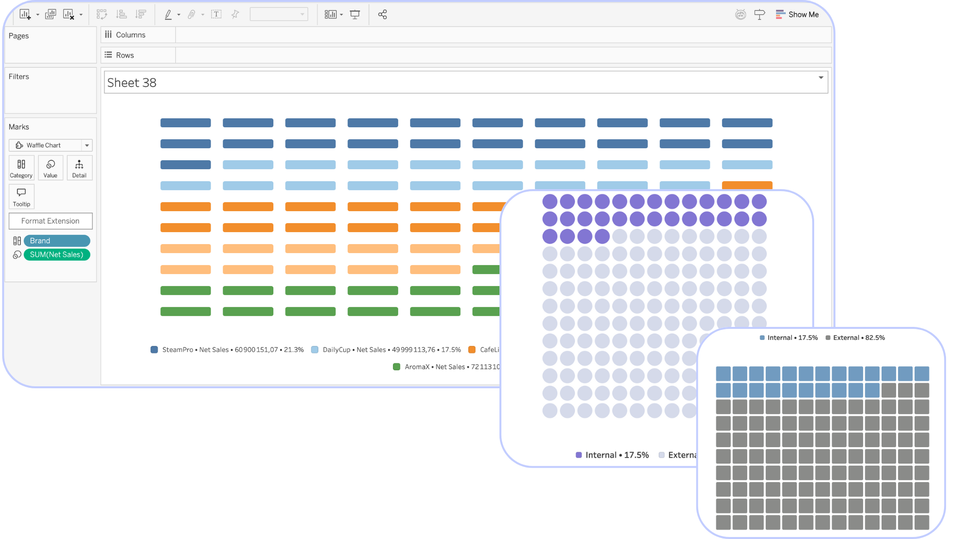
Viz Extension
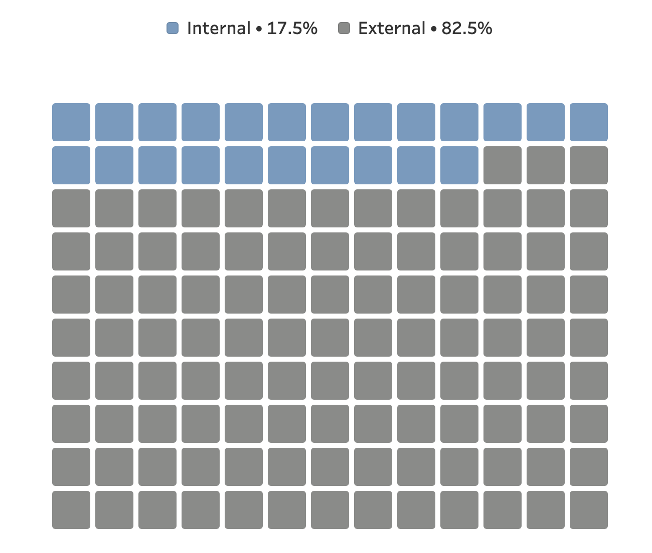
Waffle Chart
The most intuitive way to visualize percentages. Attractive and precise, it makes every proportion easy to grasp at a glance
Master Your Percentages
Beyond simple numbers, the Waffle Chart offers a structured grid layout designed for clarity, impact, and seamless dashboard performance.
Highly customizable
Adjust the number of points to perfectly fit your data scale. What better way to represent a percentage than a 100-point grid for total precision?
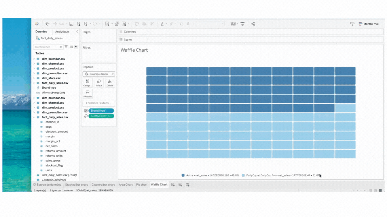
Efficient Dashboard Integration
The visualization dynamically scales to fit your layout. It ensures crystal-clear visibility and readability, even within dense or data-heavy dashboards.
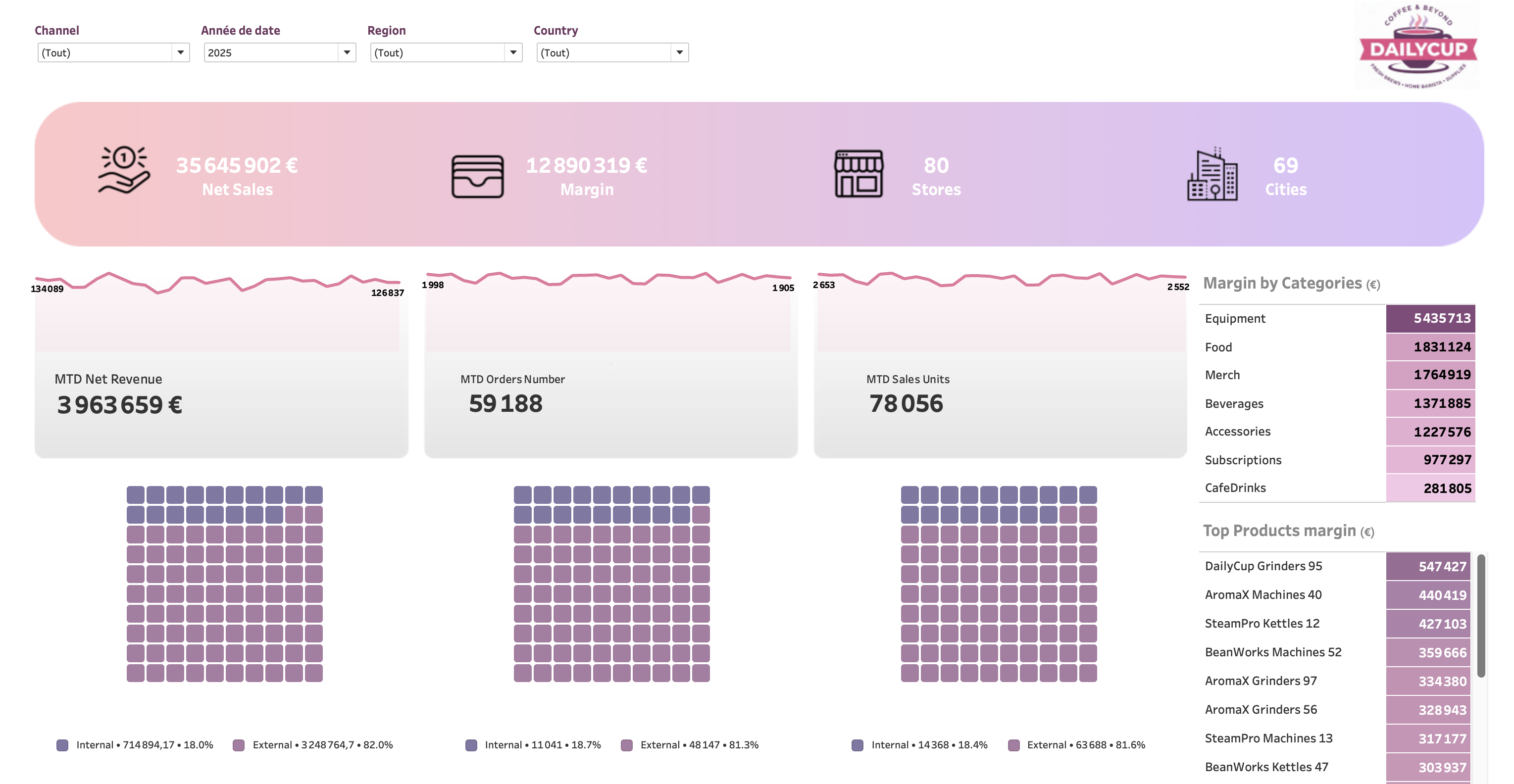
Beautiful Aesthetics
Modern, clean design that enhances the professional look of your reports. Impress your stakeholders with visuals that pop.
Try our viz extensions for free
Discover how Dataskera can transform your Tableau experience