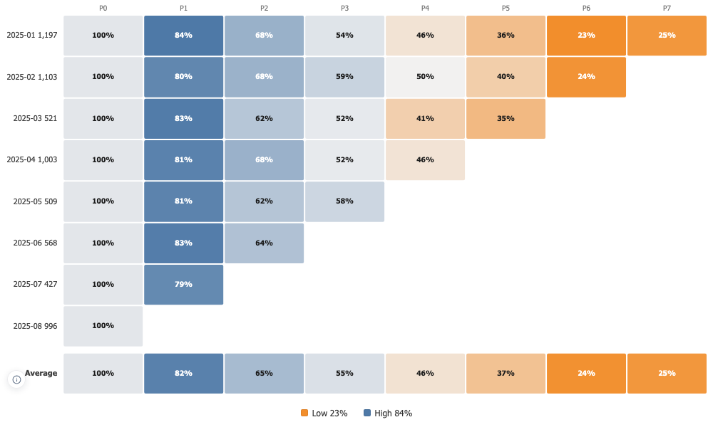

Cohort Grid
One row per cohort, one column per period since it started, colour carrying the value, and an average row underneath to compare against.
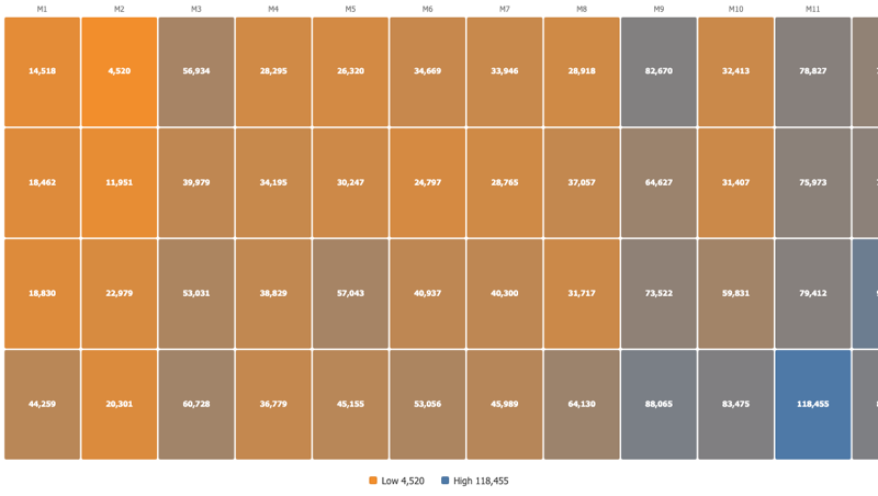
Aligned by age, not by calendar
Cohorts start together on the left whatever month they began in. Periods a cohort has not lived through yet stay empty rather than being filled with a zero, so the triangle is the truth about your data.
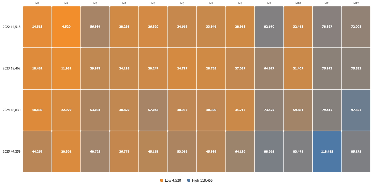
The average row analysts draw by hand
An average row under the cohorts, either treating every cohort alike or weighting each by the size it started at. Each period averages only the cohorts old enough to have reached it, so a young cohort never drags the curve down.
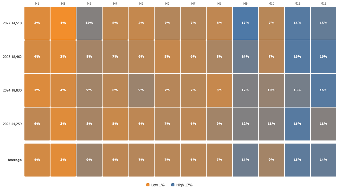
Read it three ways
The raw measure, a share of the opening period, or a share of the cohort total, on a sequential or a diverging scale with the midpoint where you want it. The opening period is a hundred percent by construction, so it is drawn as a neutral baseline rather than competing with a genuinely extreme cell.