

Viz Extensions.
Discover our published visualization extensions.
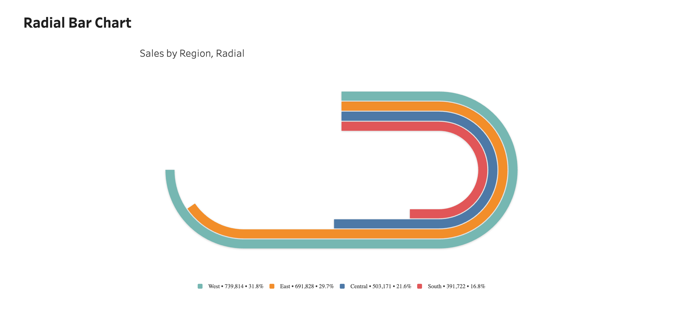
Radial Bar Chart
Turn a long bar chart into a compact circle. Compare many categories at a glance, ideal for rankings and part-to-whole views, without running off the edge of your dashboard.
Learn more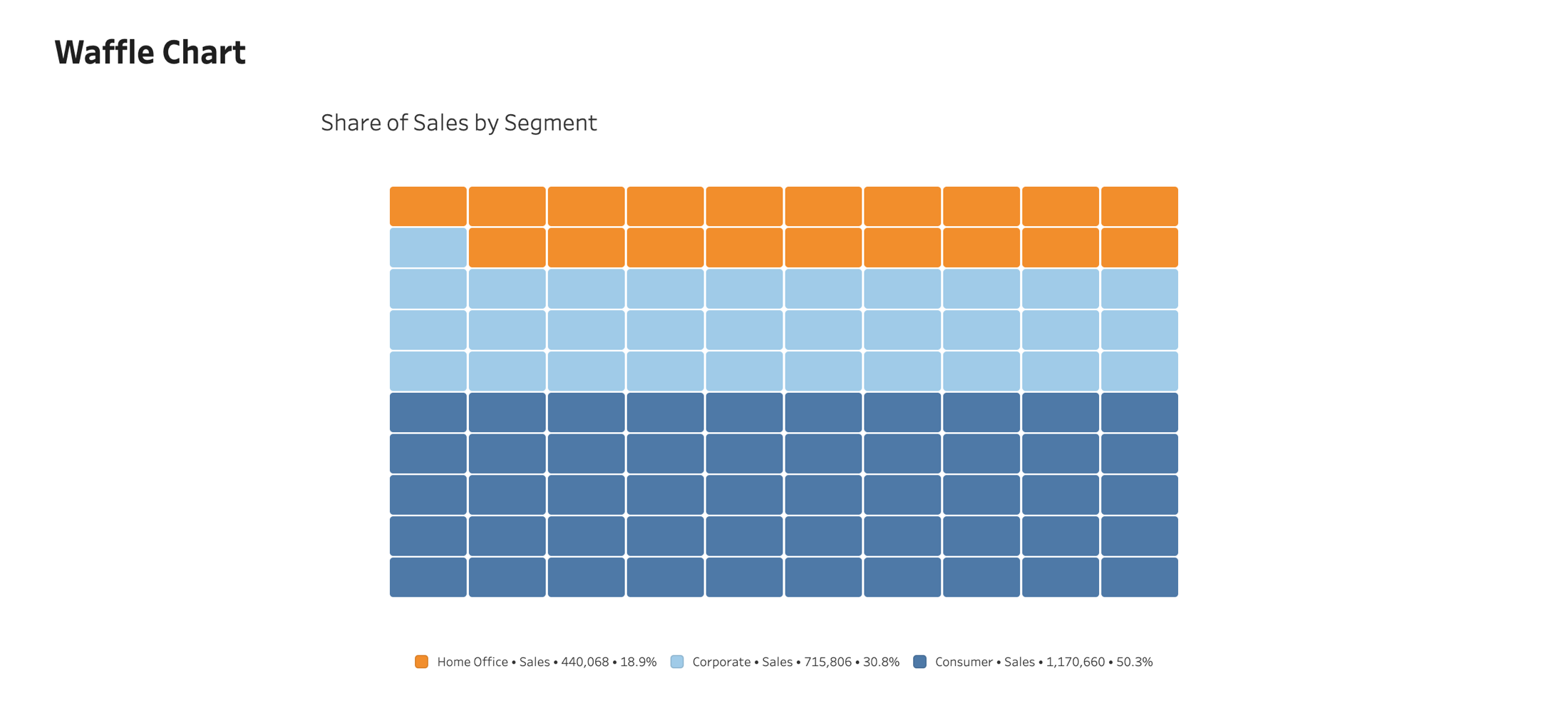
Waffle Chart
Read proportions precisely. The Waffle Chart displays categorical proportions as a grid of colored squares, making part-to-whole comparisons easy to read.
Learn more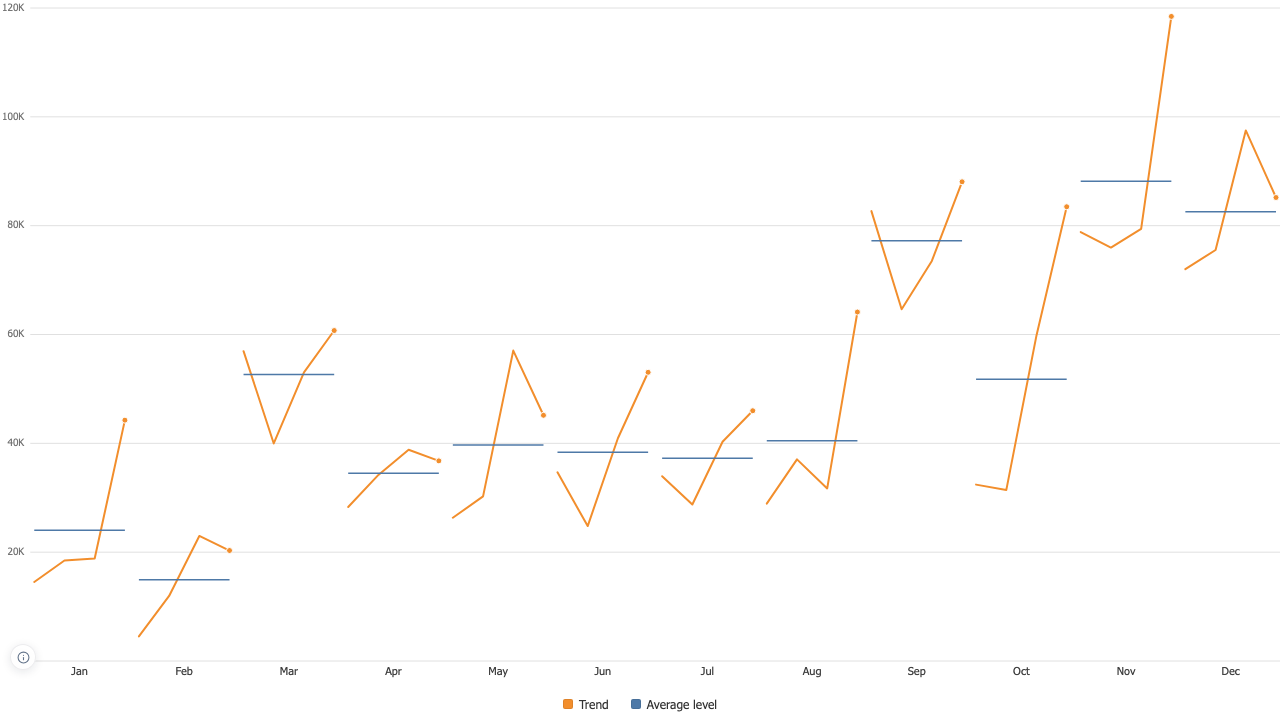
Cycle Plot
One panel per position in the cycle, the trend running inside each, and a level line showing where that position usually sits.
Learn more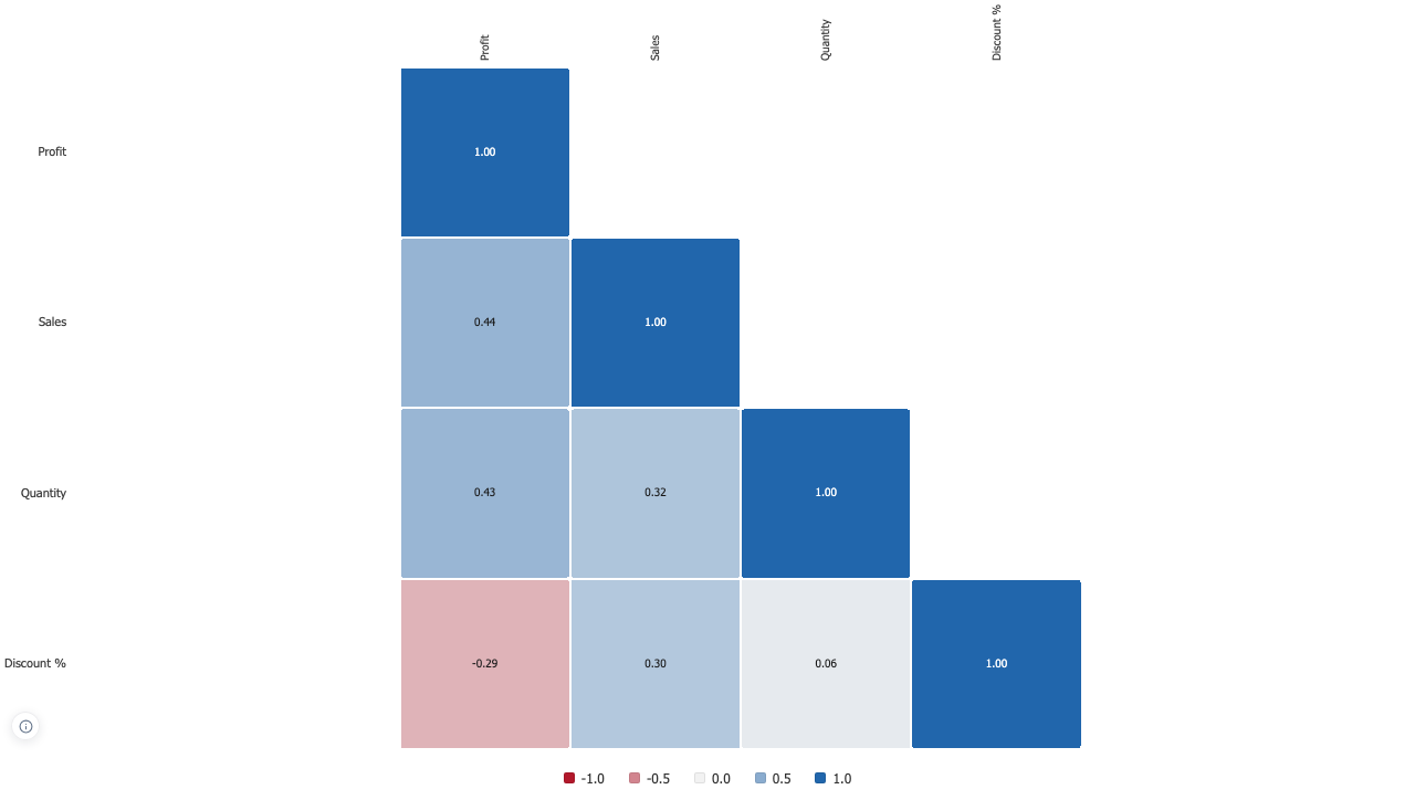
Correlation Matrix
Which of these measures move together, computed in your browser from the rows on the sheet, with the method named and the sample size behind every cell.
Learn more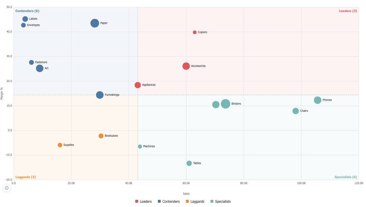
Quadrant Matrix
Two measures, a line through each and four named corners, with the dividing lines read from the data on screen instead of typed once and forgotten.
Learn more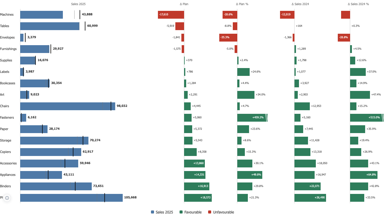
Variance Chart
Actual against plan on one line per account, with the deviation drawn from zero in its own panel, in the amount and in percent.
Learn more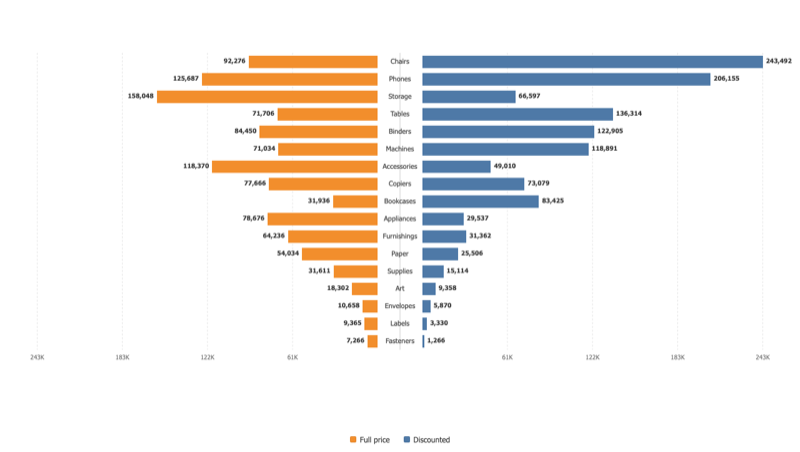
Tornado Chart
Two opposed bars per category around a shared centre. A sensitivity chart when it is sorted, a population pyramid when it is not.
Learn more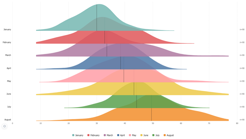
Ridgeline Chart
One density curve per group, overlapping down a shared axis, for comparing many distributions on a single page.
Learn more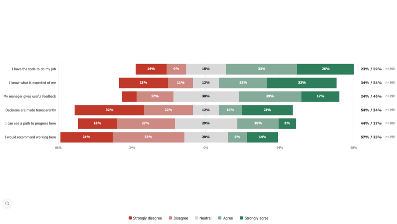
Likert Chart
Survey answers on an ordered scale, one row per question, diverging around a centre, with the treatment of the middle answer stated rather than assumed.
Learn more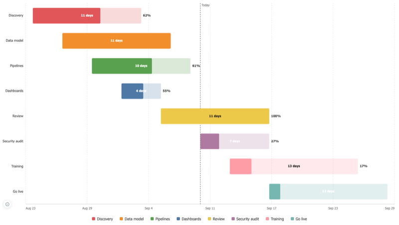
Gantt Chart
One bar per task from a start to an end, with completion drawn inside the bar and the work that should have been done by now shown as a shortfall.
Learn more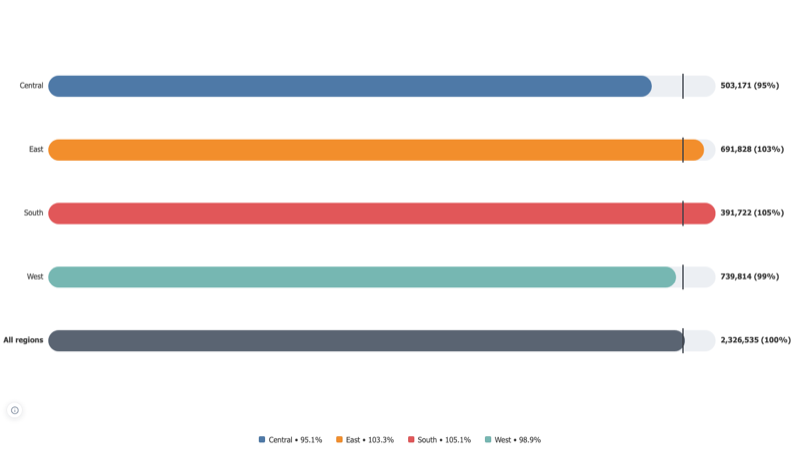
Progress Bar
Progress towards a target, one bar per category, with the target marked and an overall row computed from the totals.
Learn more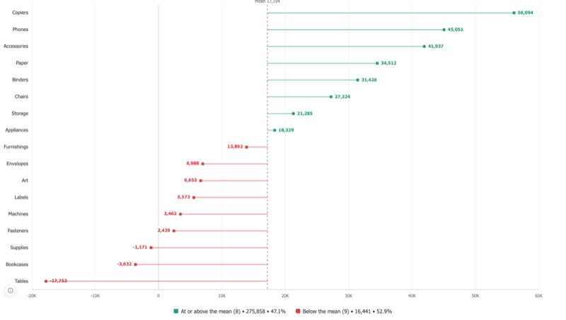
Lollipop Chart
A bar chart that keeps its nerve when there are many categories, and the one shape that can honestly be measured from something other than zero.
Learn more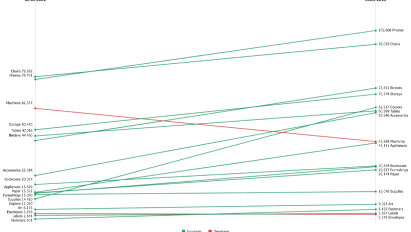
Slope Chart
Two columns, one line per category between them. Rank changes and crossings read at a glance.
Learn more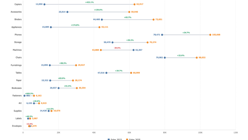
Dumbbell Chart
Two values per category, a dot each and a connector between them. The length of the connector is the change.
Learn more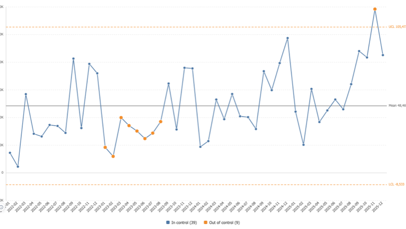
Control Chart
Statistical process control inside Tableau: control limits from the moving range, the Nelson rules, and every flagged point naming the rule that flagged it.
Learn more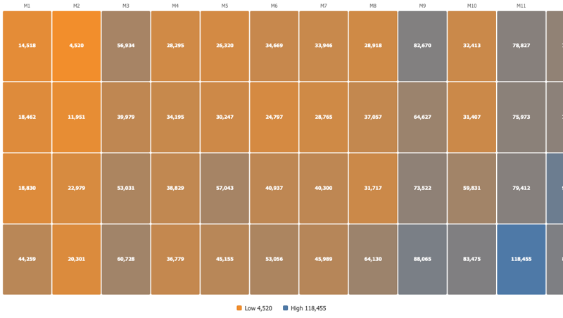
Cohort Grid
One row per cohort, one column per period since it started, colour carrying the value, and an average row underneath to compare against.
Learn more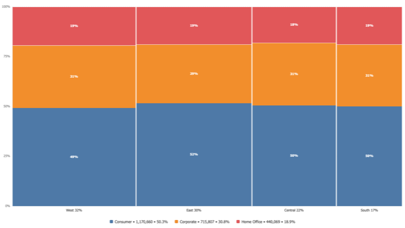
Marimekko Chart
Column width is each category share of the total, segment height is each part share of its column. Two proportions in one picture.
Learn more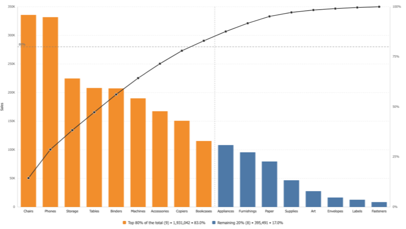
Pareto Chart
Bars falling from largest to smallest with a cumulative curve climbing to a hundred percent, and a threshold line where the vital few end.
Learn more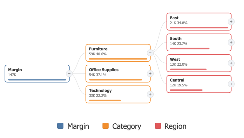
Decomposition Tree
Break a measure down dimension by dimension, choosing the path as you go. The author saves a starting layout; every reader explores their own.
Learn more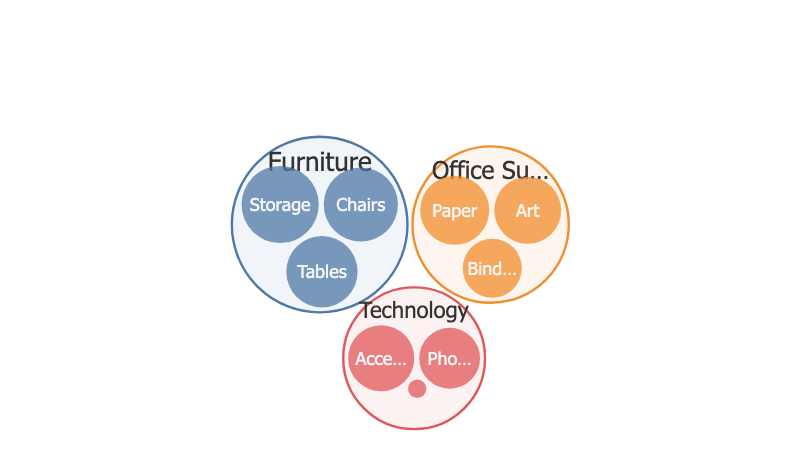
Circle Packing
A zoomable, nested view of a portfolio: levels of dimensions define the nesting, a measure defines the area, a click dives in.
Learn more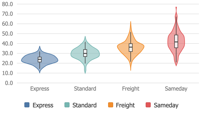
Violin Plot
The shape of a distribution per category: density, quartiles and the observations themselves, in one mark.
Learn more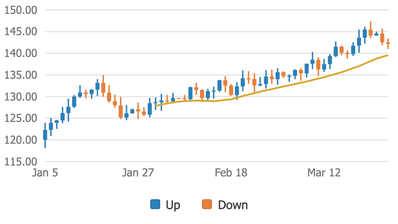
Candlestick Chart
Open, high, low and close over time, with an optional volume panel and moving average. For prices, and for any series tracked as first, peak, trough and last.
Learn more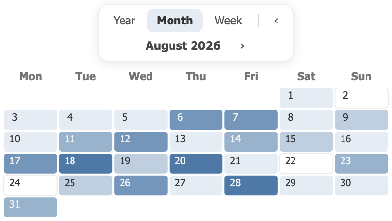
Calendar
A year, a month or a week of days, each cell carrying color and value. A day with no data stays visibly empty: null is not zero.
Learn more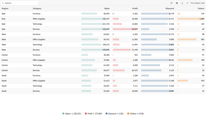
Table View
A table that reads like a report, with every column formatted on its own terms.
Learn more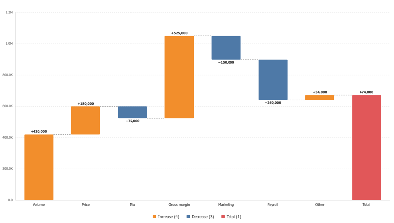
Waterfall Chart
A starting value, a run of changes, an ending value, with the arithmetic on show.
Learn more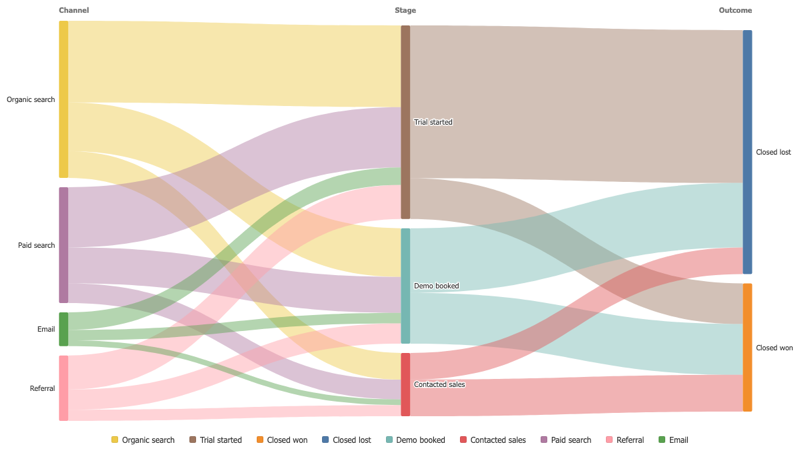
Sankey Diagram
Follow a quantity as it splits and merges from one stage to the next, and see where the flow stops.
Learn more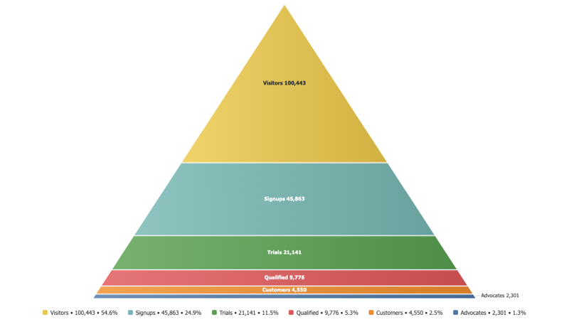
Pyramid Chart
Stages stacked from the widest to the narrowest, so a funnel reads as a shape.
Learn more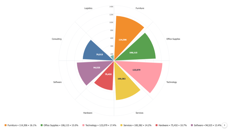
Polar Bar Chart
Bars laid out around a circle, so a cyclical pattern reads as a shape instead of a row.
Learn more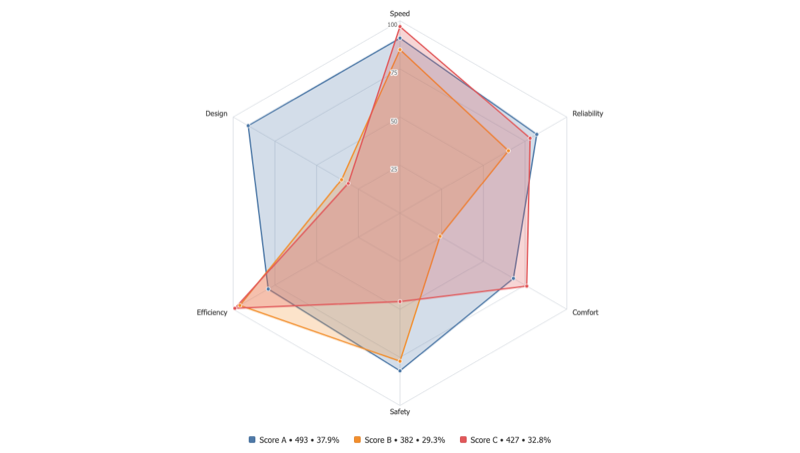
Radar Chart
Compare several measures, or several series across the same axes, on one circular grid.
Learn more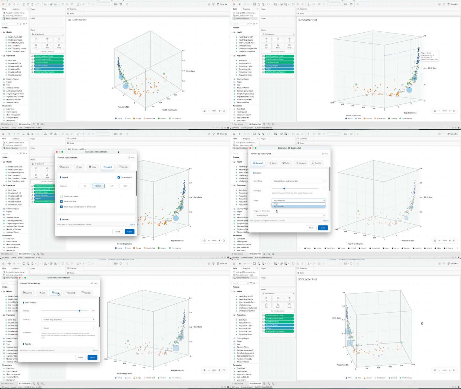
3D Scatter Plot
See three measures at once. The 3D Scatter Plot places your points in a real 3D axis box that you rotate and zoom inside your dashboard, with color and shape by category and an optional size measure.
Learn more