
Cycle Plot
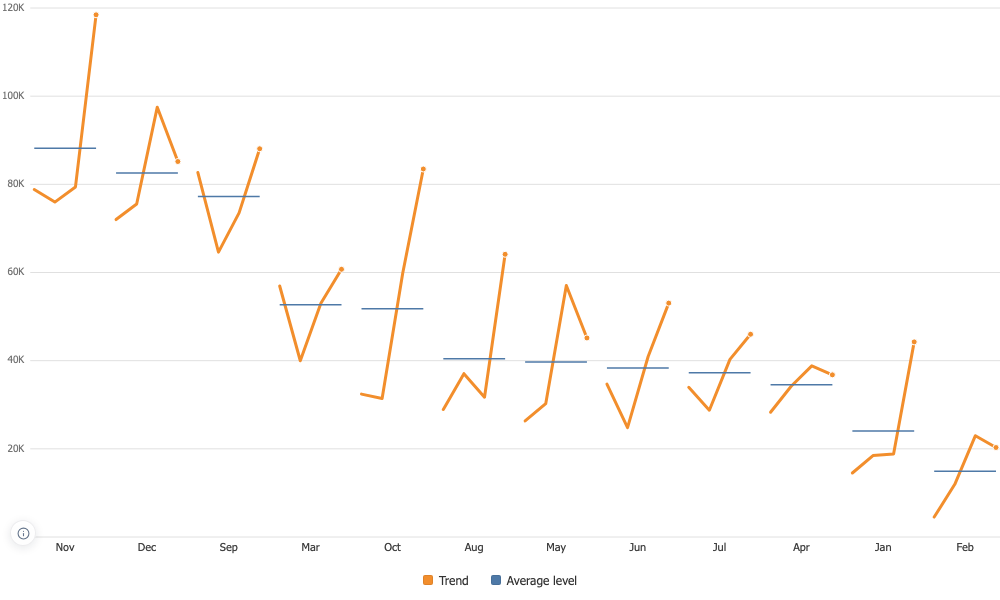
One panel per position in the cycle, the trend running inside each, and a level line showing where that position usually sits.
Two questions, read apart
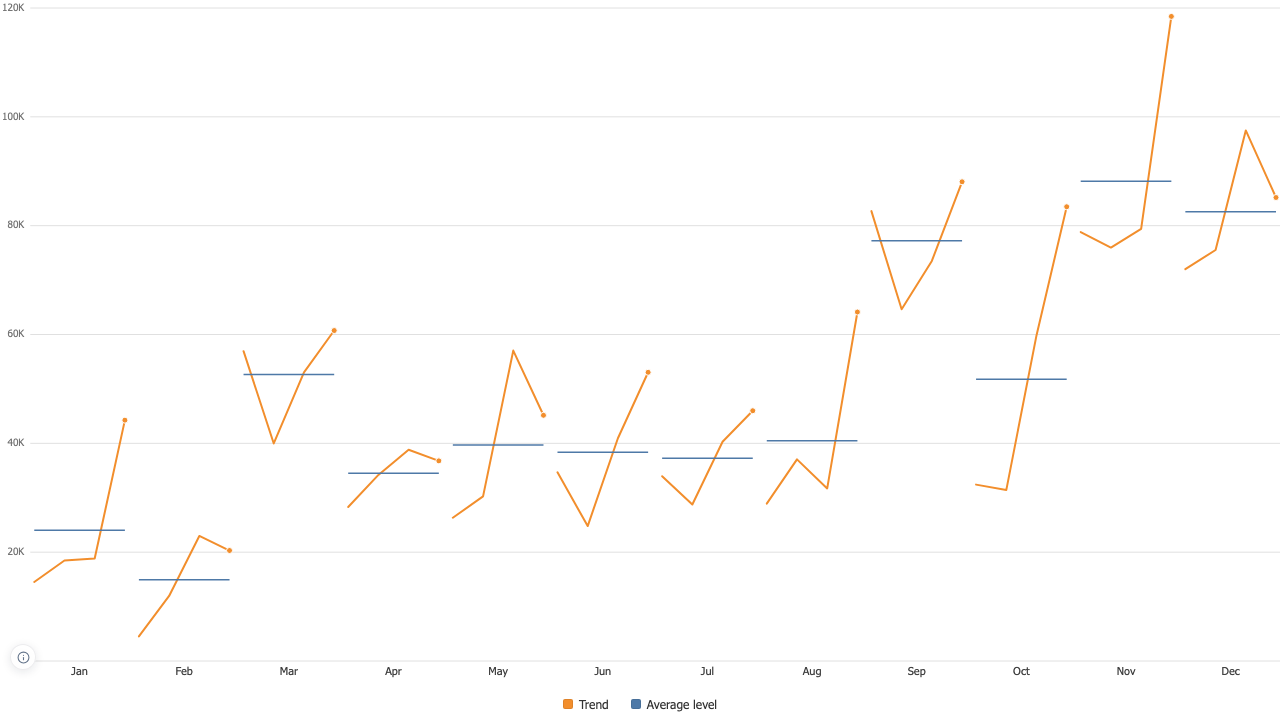
Which month is the busy one, and is that month getting busier. A line by date answers neither. Here the level between panels answers the first and the trend inside each panel answers the second. On four years of Superstore, November averages 88,167 against February at 14,938, and every month is still visibly growing year on year underneath that.
The cycle keeps its own order, and its own start
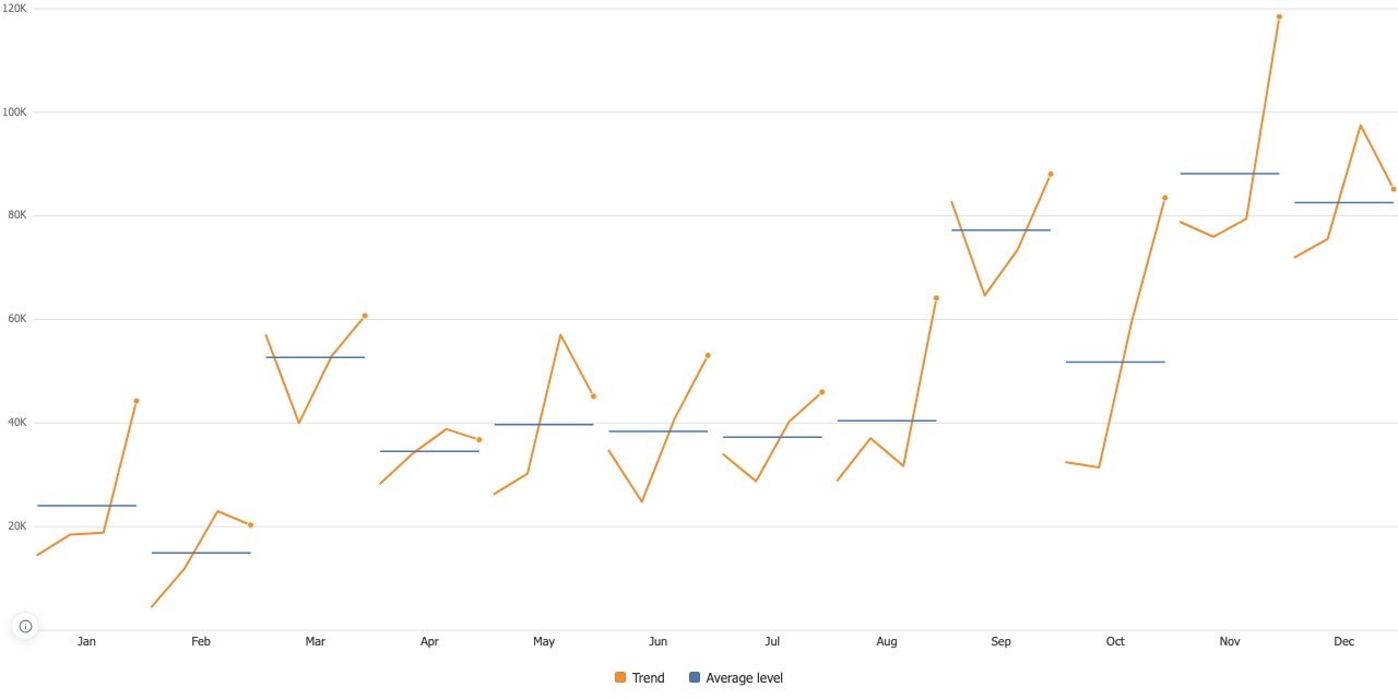
Alphabetical opens the week on Friday and the year on April. Days, months, quarters and plain numbers are recognised and put in their own order, with numbers sorted as numbers. And where the cycle starts comes from your data: a week delivered Monday first stays a Monday-first week, and a year delivered from April stays a fiscal year.
A gap breaks the line
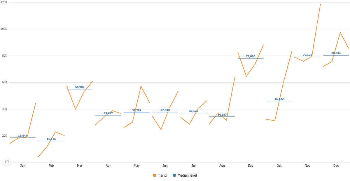
A straight segment across a missing period would draw data that was never collected, so the line stops and starts again and the chart counts what was missing. One shared axis is the default, because panels scaled to themselves fill the space better and stop being comparable, which is most of the point.