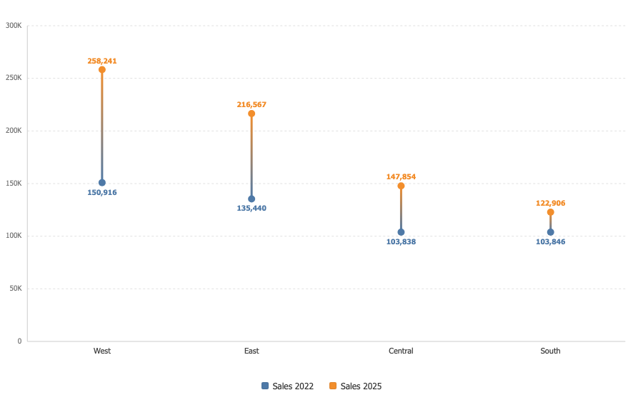

Dumbbell Chart
Two values per category, a dot each and a connector between them. The length of the connector is the change.
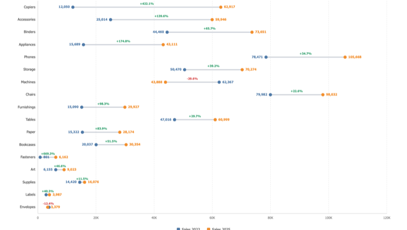
Sorted by how far, not which way
Sorting by change buries the biggest collapse at the bottom of the chart. Sorting by the size of the move, in either direction, brings the real movers to the top. On Superstore that puts Copiers first at plus 422 percent and Machines high up at minus 30.
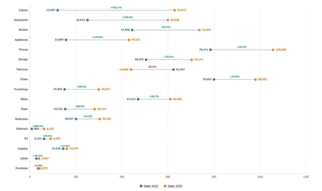
Direction you can see
Colour the connector by direction, blend it between the two dot colours, or keep it neutral. The change label rides the connector as a number or a percentage.
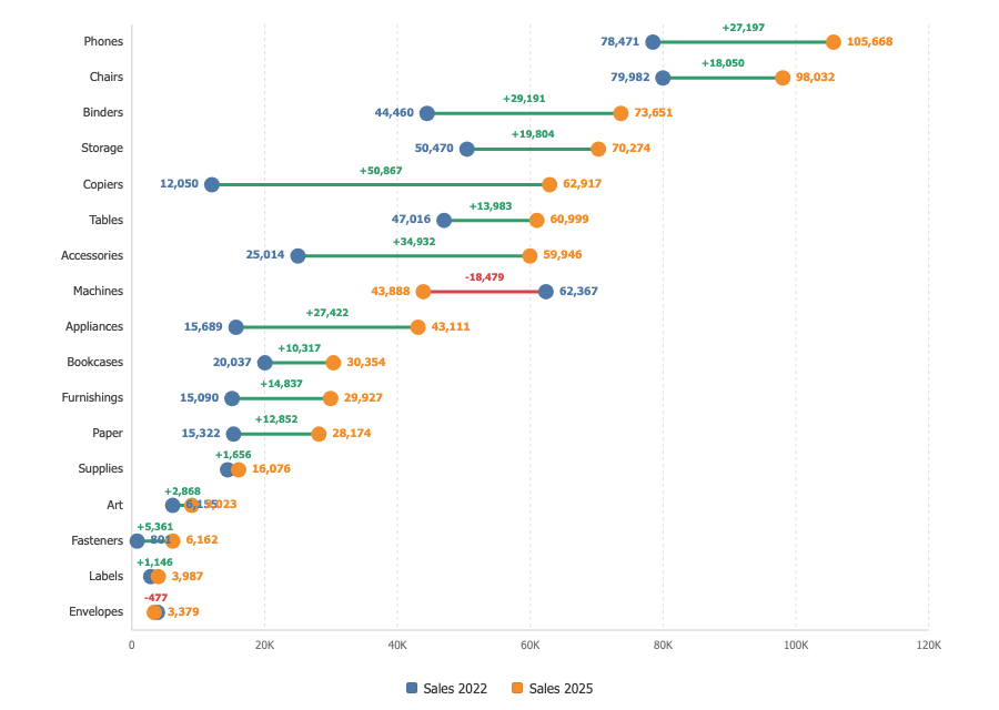
Horizontal or vertical, and never overprinted
The same pairs read down the page or across it. A dot near an edge puts its value label on the other side of itself rather than on top of the category name, and a category carrying only one of the two measures is declared, not drawn as a value that did not move.