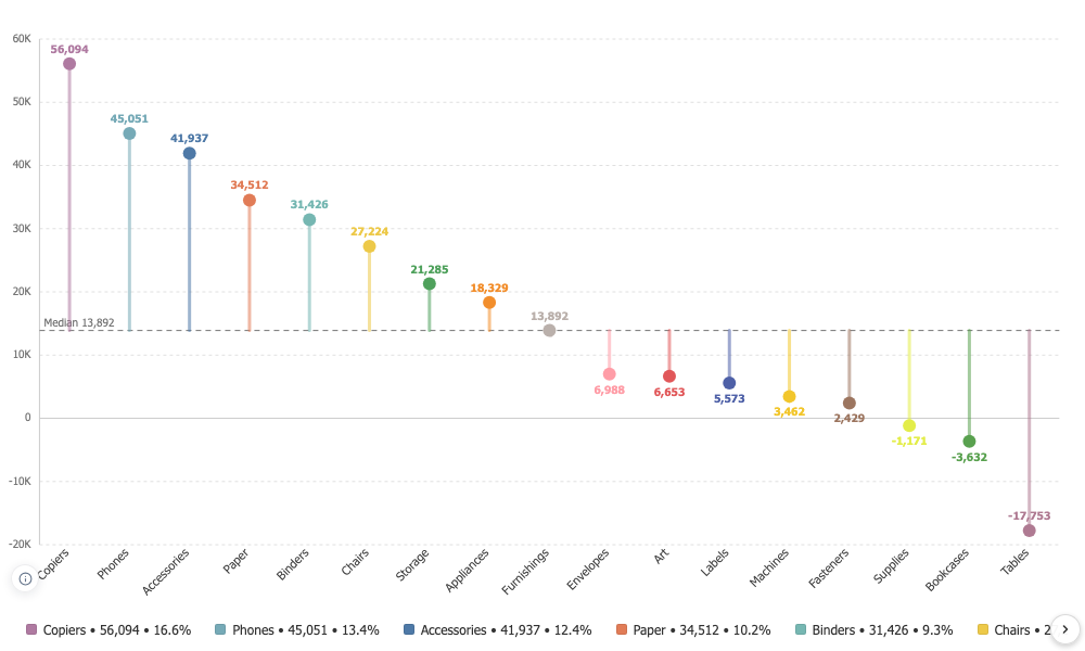

Lollipop Chart
A bar chart that keeps its nerve when there are many categories, and the one shape that can honestly be measured from something other than zero.
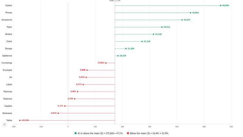
Many categories, no wall of ink
Thin stems and small heads stay readable where bars turn into a solid block. Sort them, colour them by a dimension, put them across or down the page.
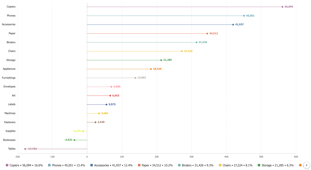
A baseline that says what it is
Measure from zero, the mean, the median, the lowest value or a value you choose. The baseline is drawn, labelled with its own number, and declared in the data notes, because a stem measured from an unstated place is a quiet lie. On Superstore profit, eight sub-categories sit above the mean of 17,194 and nine below.
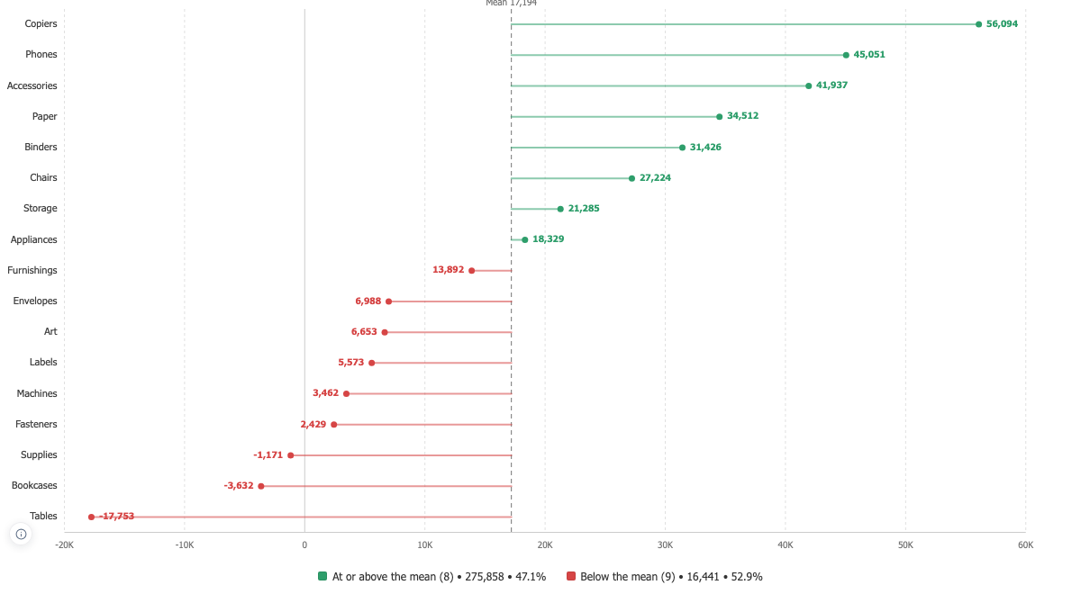
Above and below, in two colours
Once the baseline is not zero, which side a mark falls on is real information. Colour the two sides and the legend reports the split with its counts and totals rather than contradicting the chart with a list of category colours.