
Pareto Chart
Bars falling from largest to smallest with a cumulative curve climbing to a hundred percent, and a threshold line where the vital few end.
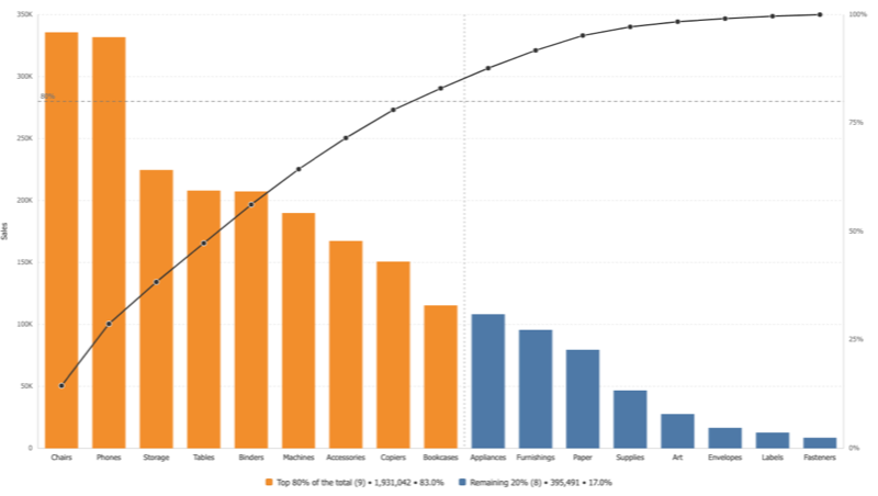
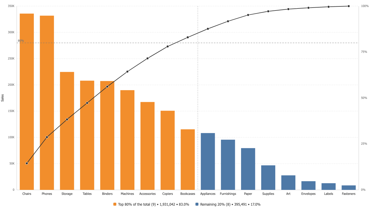
The split is drawn, not implied
A vertical marker sits exactly where the cumulative curve crosses your threshold, and the two colours change at the same bar. On Superstore, nine of seventeen sub-categories carry 83 percent of sales, and the legend says so in real numbers.
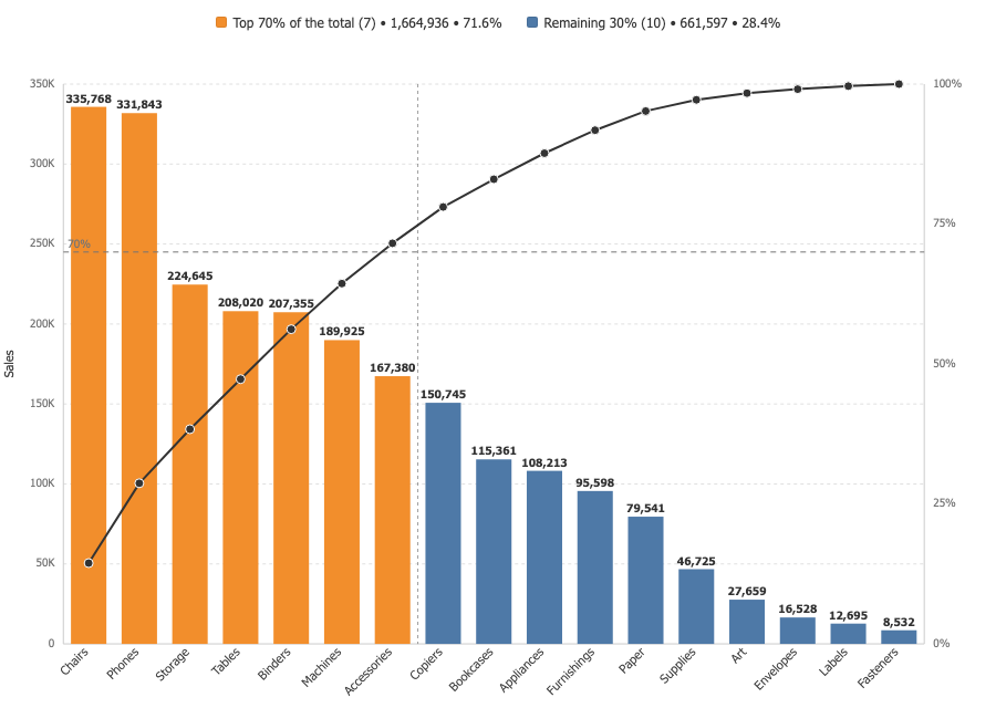
Your threshold, your reading
Move the threshold and everything follows: the line, the marker, the colours and the legend totals. Seventy percent and eighty percent are different conversations, and the chart supports both without a calculated field.
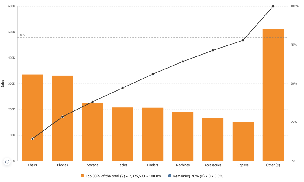
A long tail folded honestly
Past a bar count you choose, the rest becomes one bar carrying their true total and the curve still reaches a hundred percent. The merged bar is not clickable, because it stands for many categories and filtering on it would be a lie.