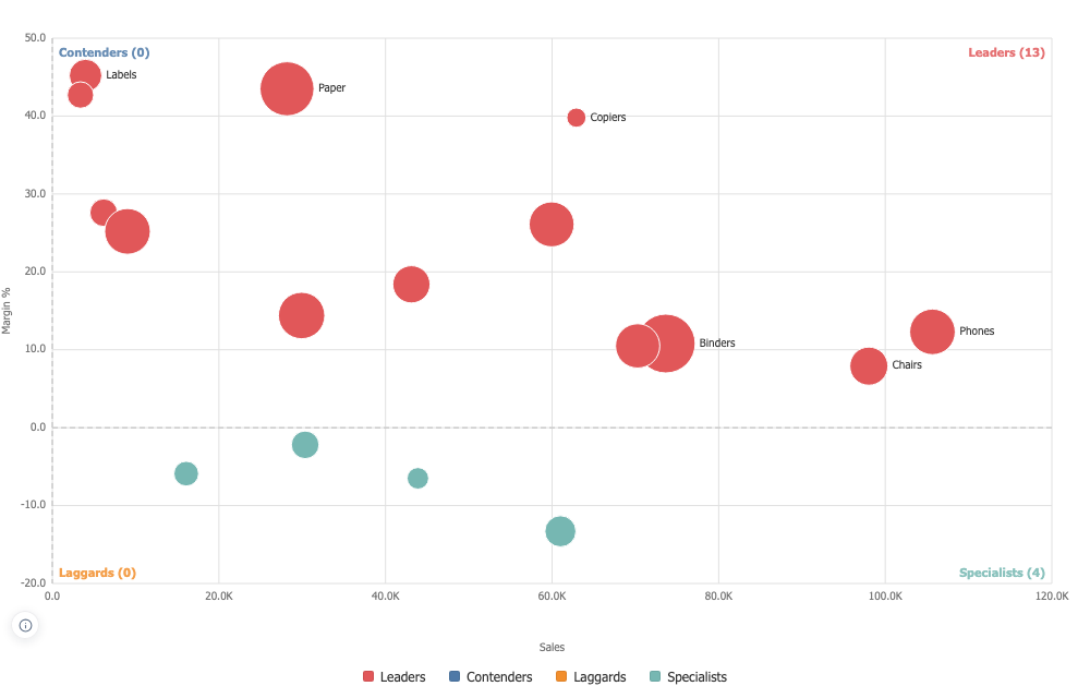

Quadrant Matrix
Two measures, a line through each and four named corners, with the dividing lines read from the data on screen instead of typed once and forgotten.
The lines follow the filters
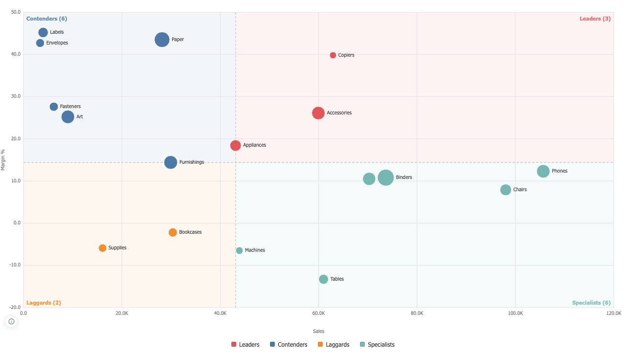
A threshold typed once and left behind is how this chart goes wrong: the data moves and the line stays where it was one afternoon. The default is the median of what is on screen, recomputed every time, with the average, the mid-range, zero and fixed values as alternatives. Whichever rule drew them, the chart prints where its lines came from and whether they move.
Name the corners for the question you are asking
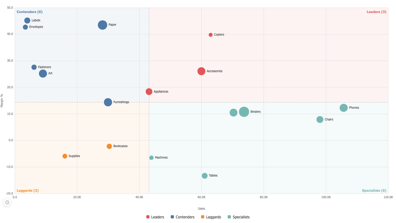
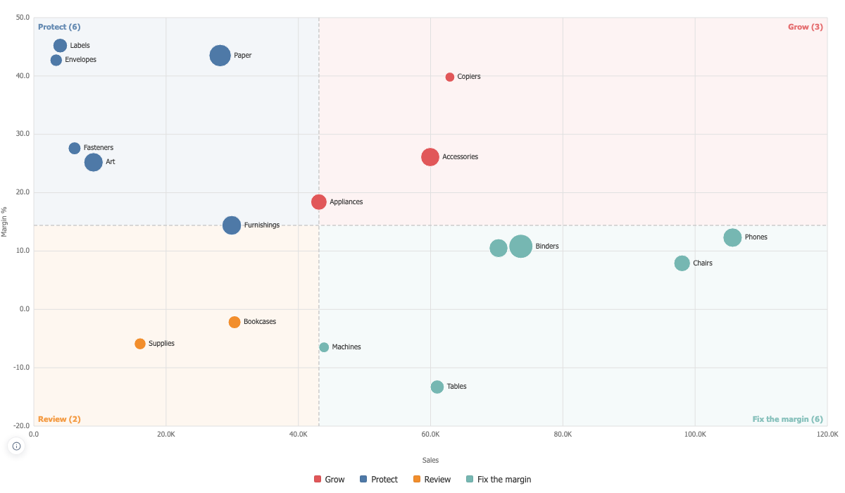
Grow and Fix on a portfolio, Accept and Mitigate on a risk register, Champions and At Risk on a customer base. Each corner carries how many items landed in it, in the chart and in the legend. On Superstore, sales against margin puts Accessories, Appliances and Copiers in the top right and leaves Tables at minus thirteen percent on sixty-one thousand of sales.
Names that never overprint, sizes that never exaggerate
Labels claim their box and every dot claims its circle, so a name is never drawn across another name or across a neighbouring point; what was left off is counted and every point still carries its name in the tooltip. Size is carried by area, so twice the measure is twice the ink rather than four times it.