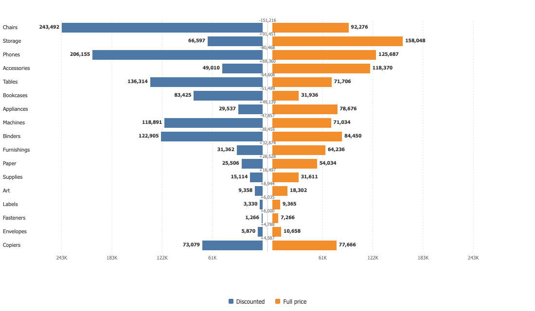

Tornado Chart
Two opposed bars per category around a shared centre. A sensitivity chart when it is sorted, a population pyramid when it is not.
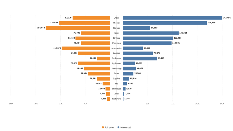
The funnel that names the chart
Sorted by the width of the pair, the rows narrow from top to bottom and the drivers that move the number most sit where the eye lands first. On Superstore, chairs make the widest pair of full price against discounted sales.
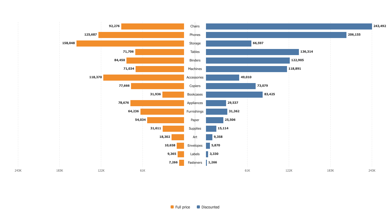
A population pyramid, same chart
Leave it in data order with age bands on the category shelf and the same drawing is the demographic chart everyone knows. Category names run down the centre or sit on the left, whichever reads better.
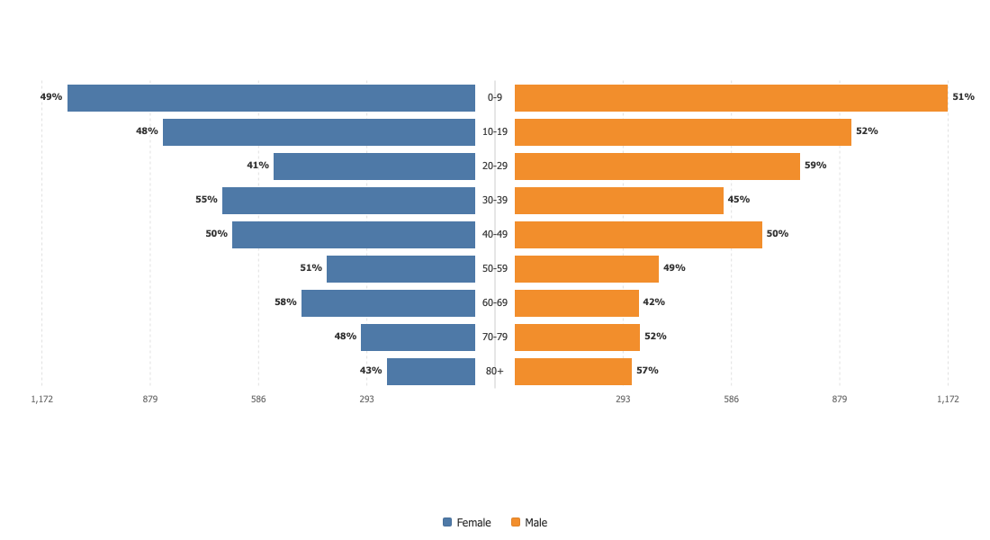
One axis, on purpose
The widest bar on either side sets the scale for both, so a small quantity cannot be drawn as large as a big one. Independent axes fill the page better; choose them and the chart says the two halves can no longer be compared by length.