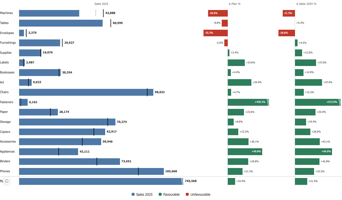

Variance Chart
Actual against plan on one line per account, with the deviation drawn from zero in its own panel, in the amount and in percent.
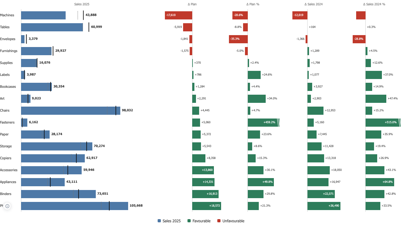
The bar is the amount, the plan crosses it
A second bar beside the first turns the comparison into a race for length and the value stops being readable. The plan is a needle across the actual bar instead, so how far the bar reaches still means the amount, and the gap gets a panel of its own measured from zero, because a gap is a quantity in its own right.
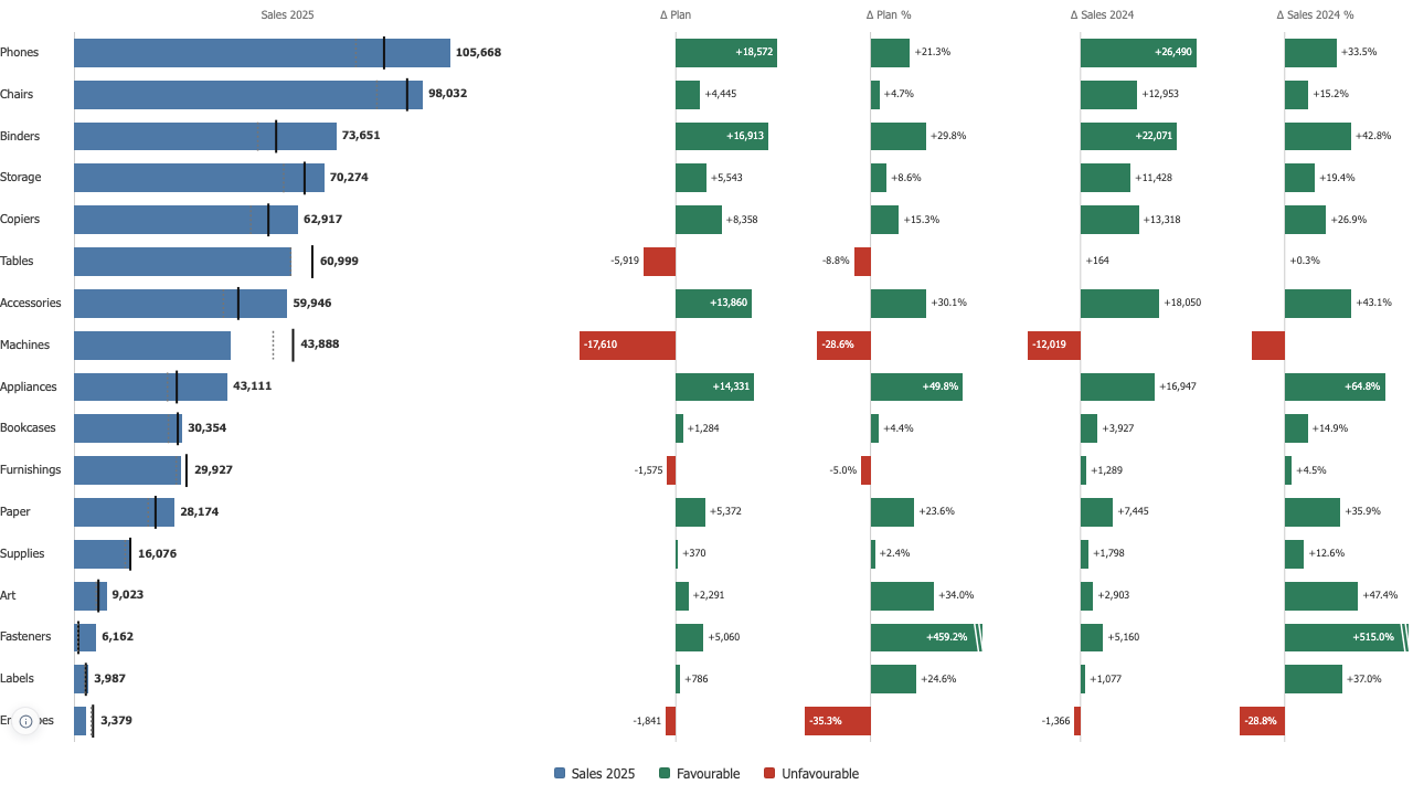
Above plan is good, until it is cost
On revenue, above plan is good. On cost, above plan is a problem. Nothing in the data carries that, so you declare it once and the deviations colour themselves. Choose lower is better and the chart says so in its data notes, rather than leaving a reader to work out why an overrun is red.
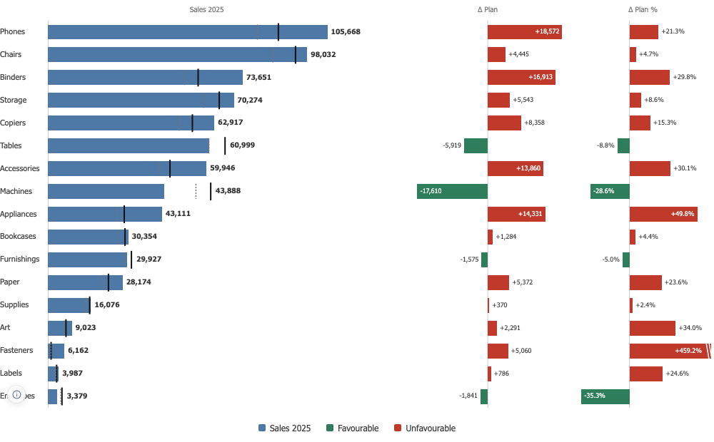
A total that adds up, and percentages that are honest
The total divides the sum of the actuals by the sum of the plans, never the average of the row percentages. On Superstore 2025 against last year plus ten percent, that is 745,568 against 675,328, ten point four percent ahead. A plan of zero has no percentage and reads n/a; a negative plan keeps its direction; and Fasteners at plus 459 percent is cut at the panel edge with its real number printed, so one small base cannot flatten every other bar.