Violin Plot
Tableau Viz Extension
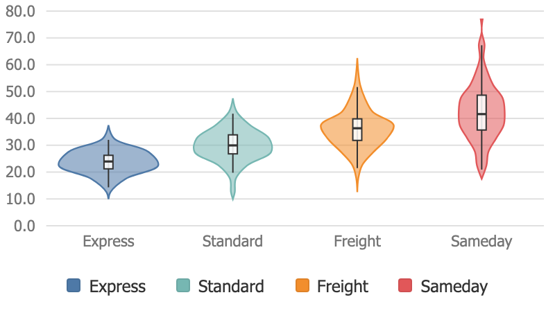
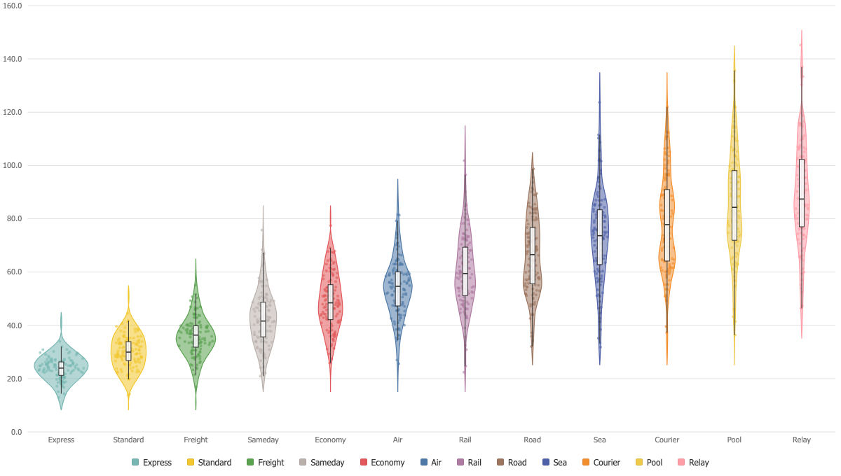
The shape of a distribution per category: density, quartiles and the observations themselves, in one mark.
Density, quartiles, observations
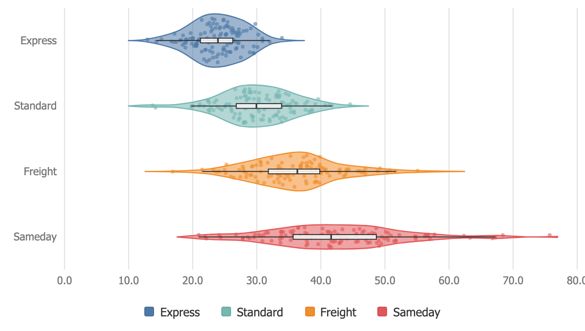
Each violin carries its density curve, a box with the quartiles and the median, and optionally every observation as a jittered dot. Three views of the same data, one mark.
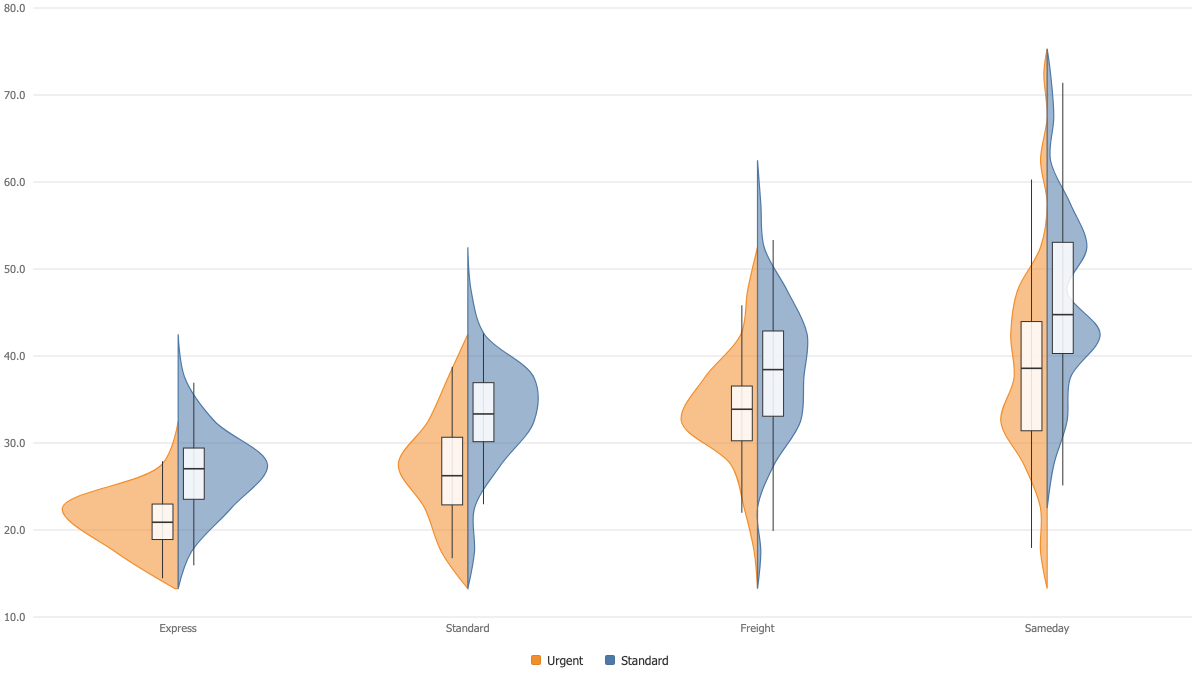
Two groups face to face
With a two-member dimension on Color, each violin splits down the middle and the two halves face each other, which is the cleanest way to compare a pair of distributions category by category.
Horizontal when labels are long
Flip the orientation and the violins lie down, giving long category names a full line each. Densities can be exact histogram counts or a gaussian smoothing, both honest about what they show.