
Waffle Chart
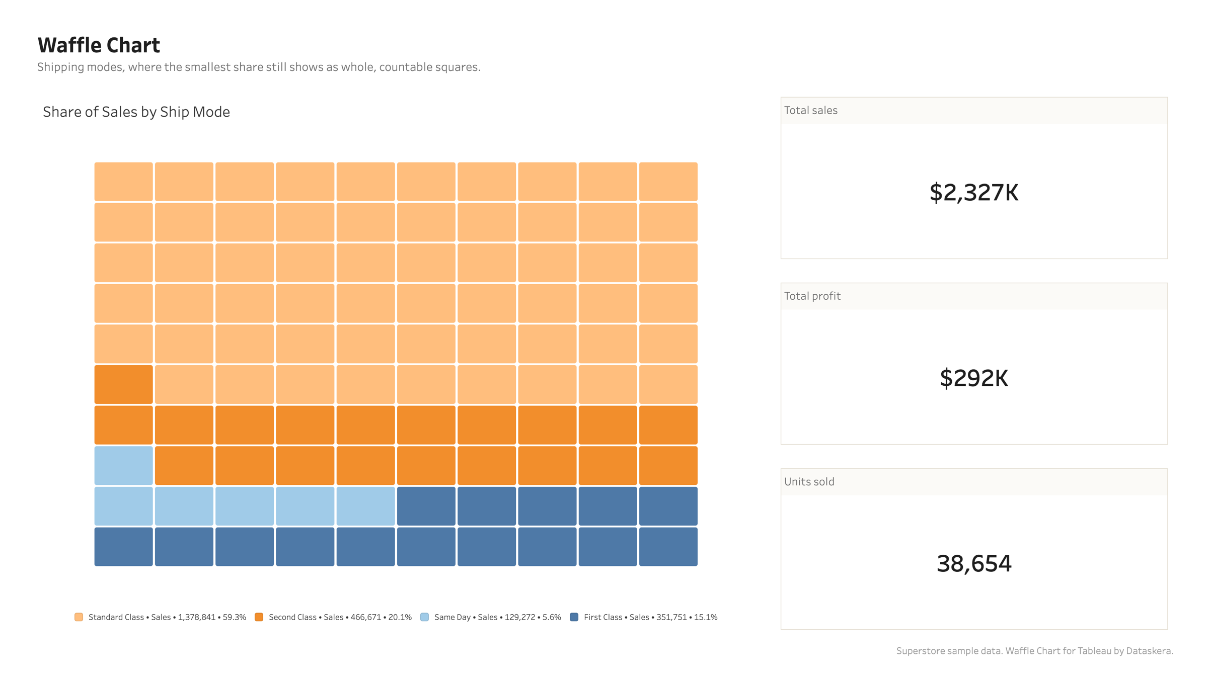
Read proportions precisely. The Waffle Chart displays categorical proportions as a grid of colored squares, making part-to-whole comparisons easy to read.
Native Tableau integration
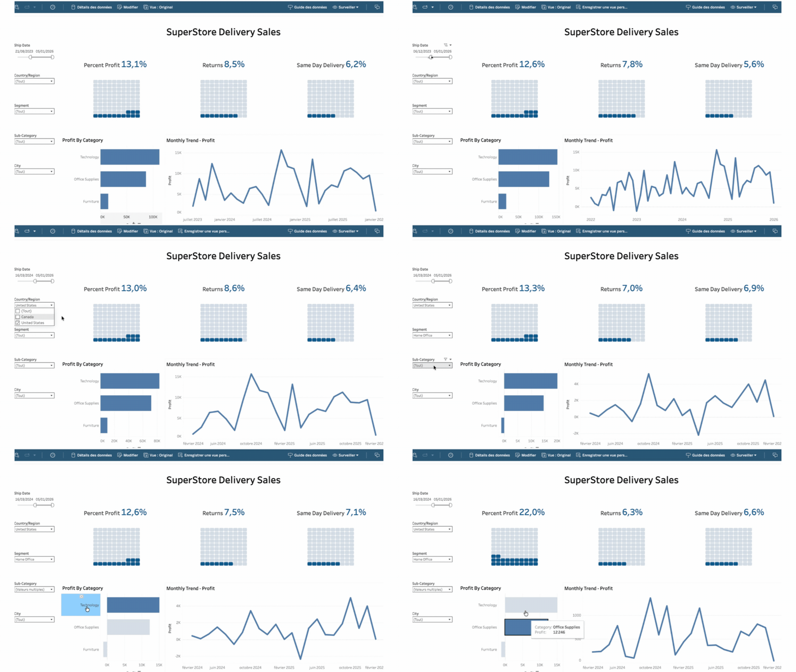
Native to your dashboard Add it to a worksheet like any Tableau viz. It follows your filters, sorts, and dashboard actions, and refreshes live as the data changes. Nothing to export, connect, or configure.
Design & customization
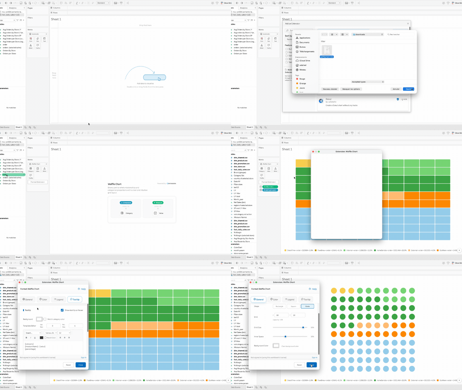
Customize every detail Pick a palette or set a precise color for each category. Choose square, rectangle, or circle cells, and fine-tune the grid, spacing, legend, and tooltip. Every element is yours to shape, so the chart fits the rest of your dashboard.
Every percent is one square
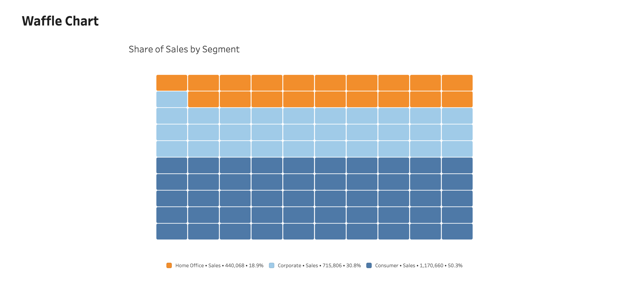
On a 10 by 10 grid, 100 cells make 100%, so each cell is exactly 1%. Even a single-percent share appears as one clear, countable square, where a pie or a bar would lose it. Proportions stay easy to read and compare.